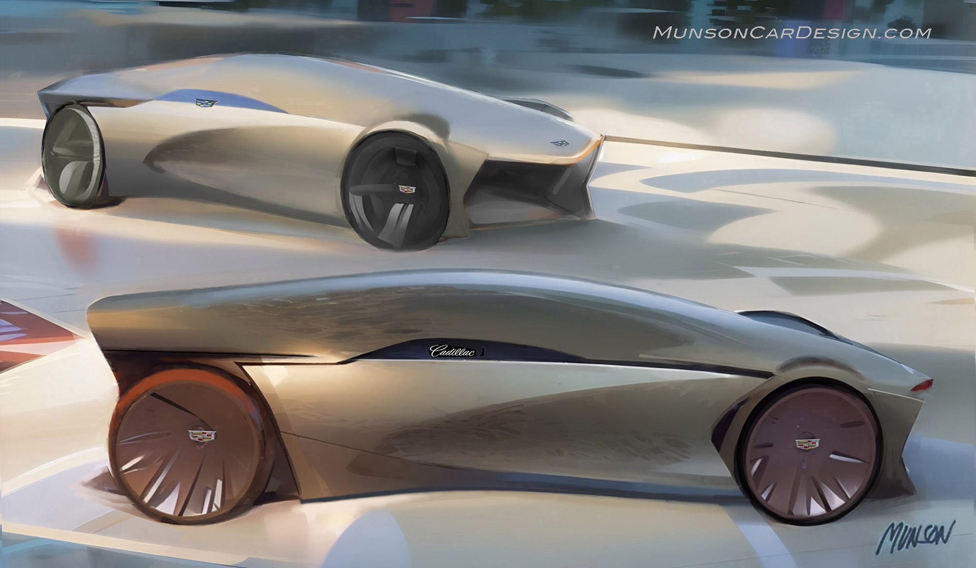
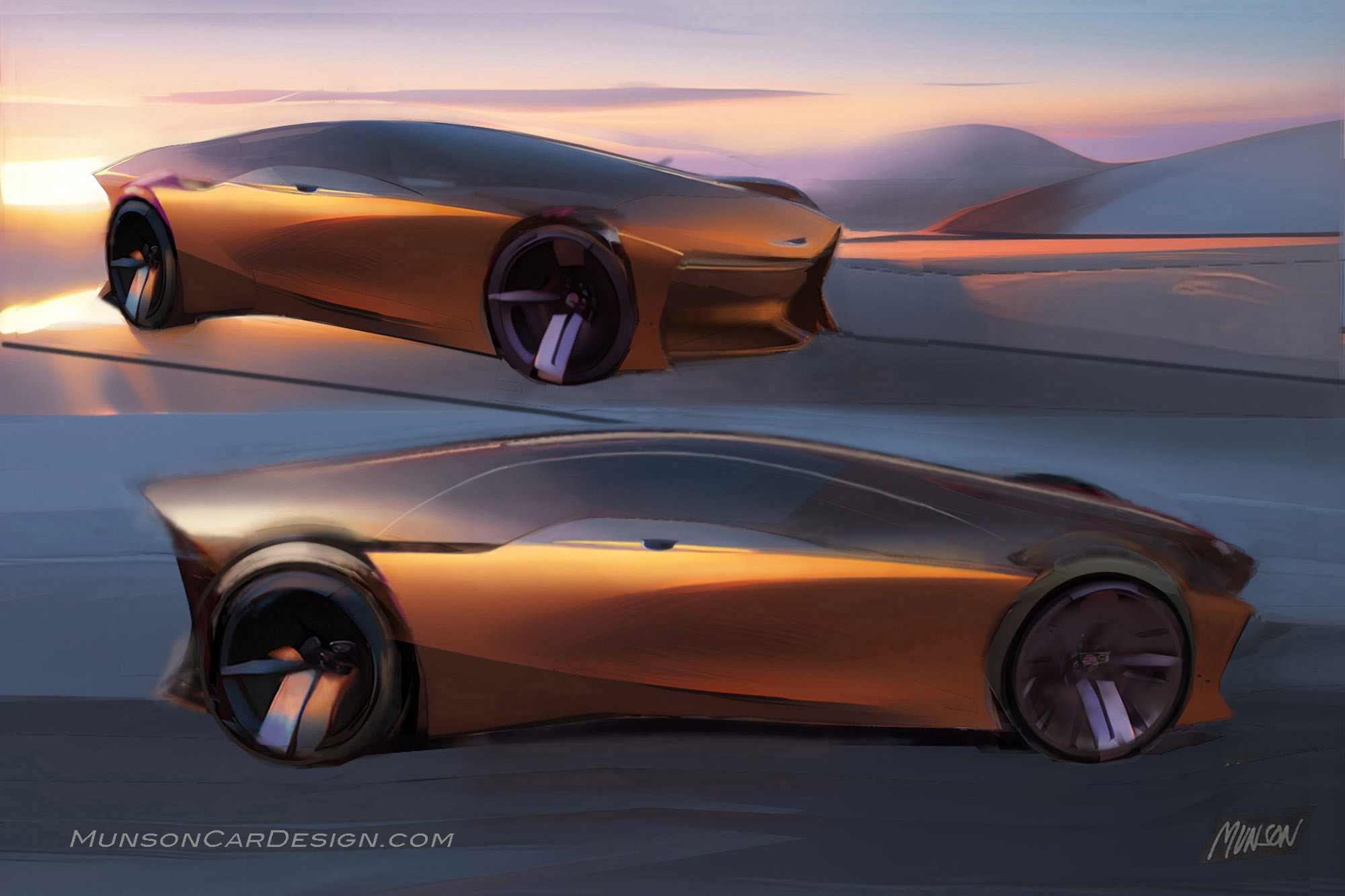
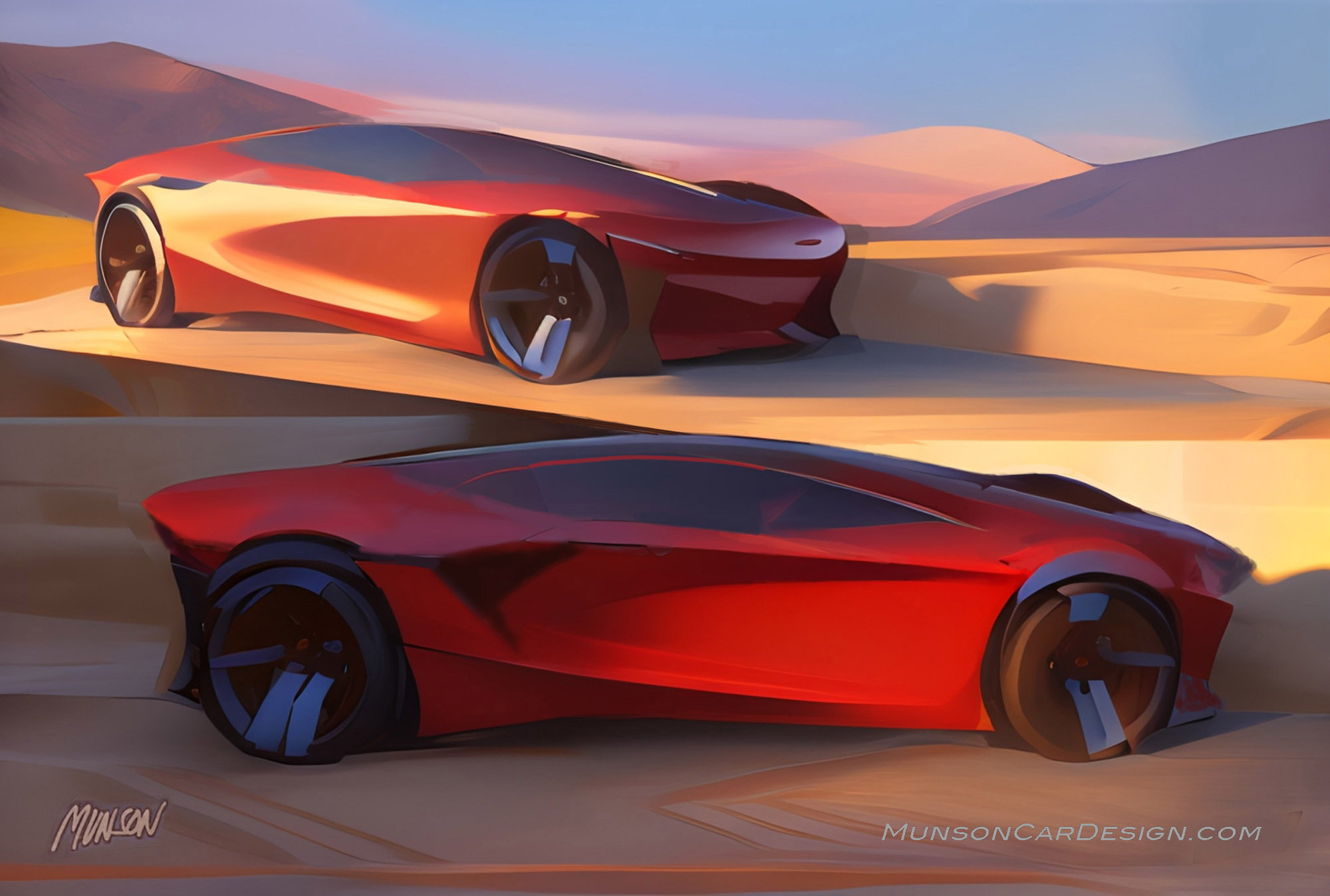
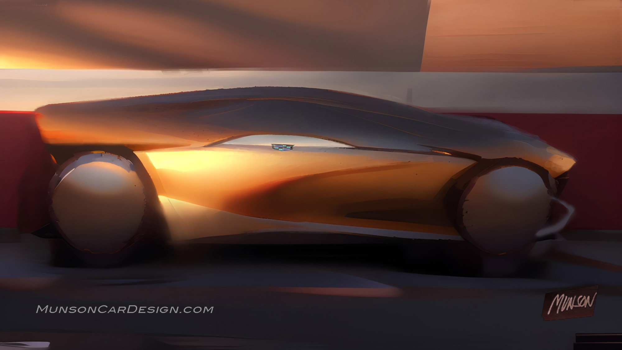
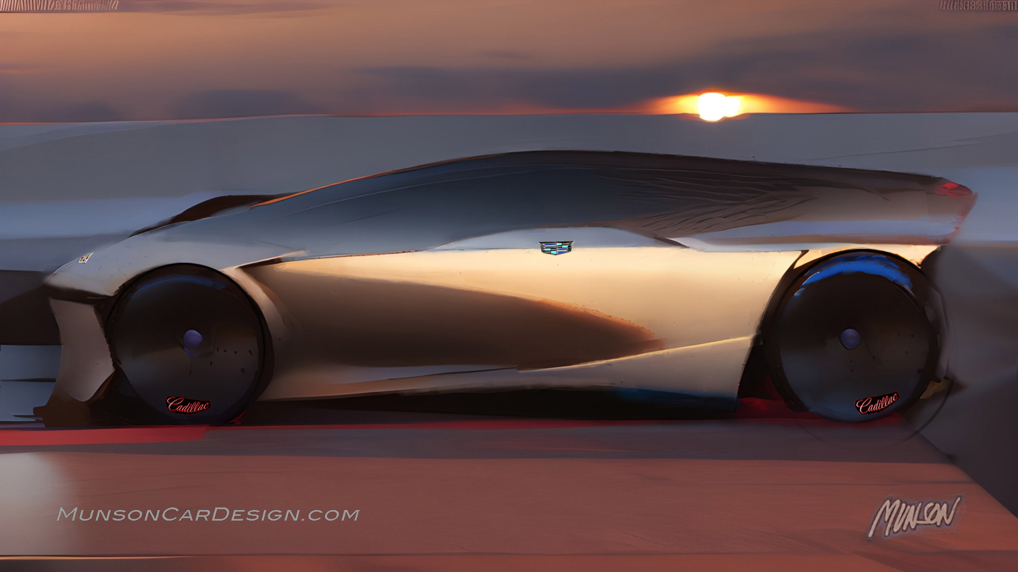
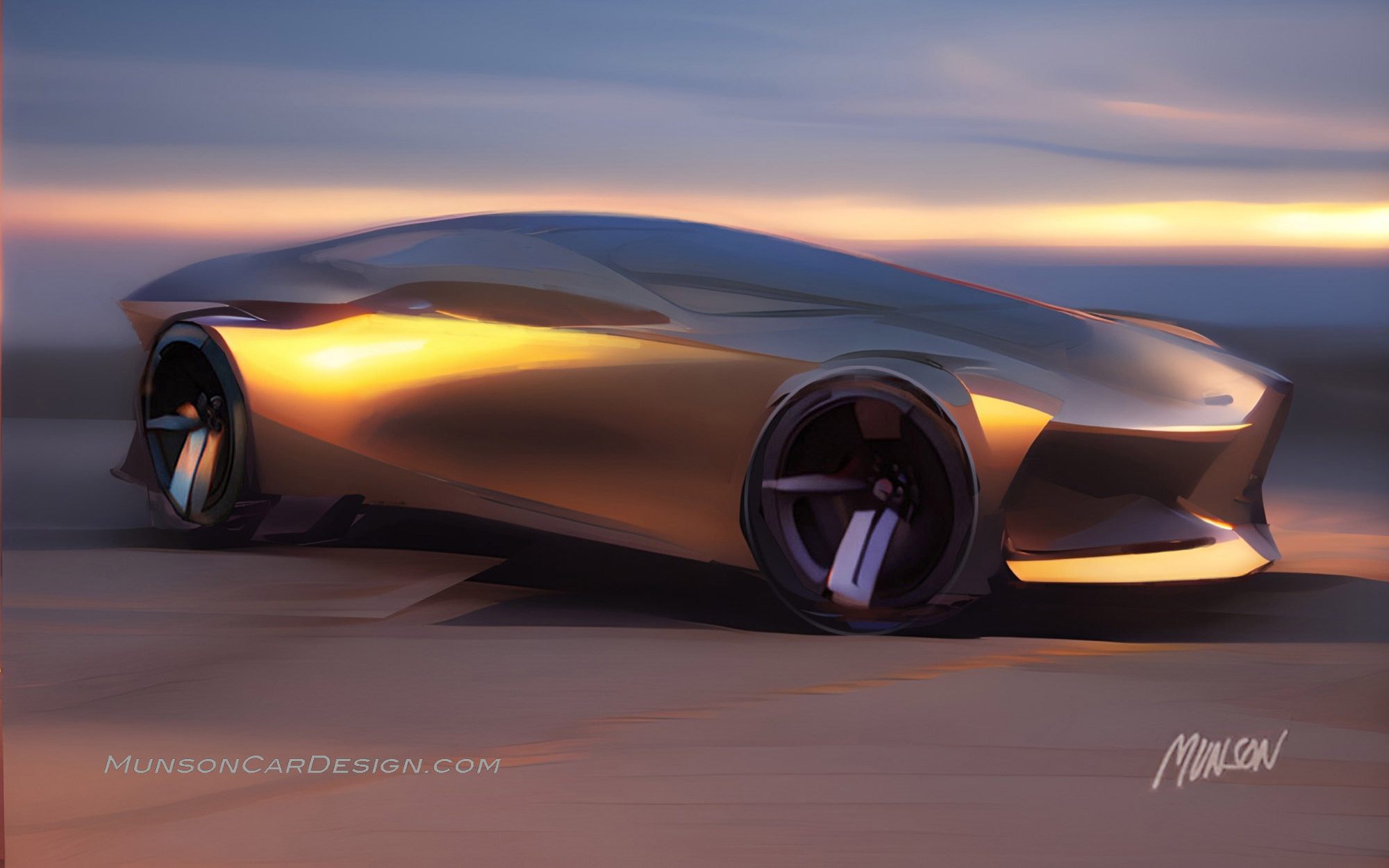
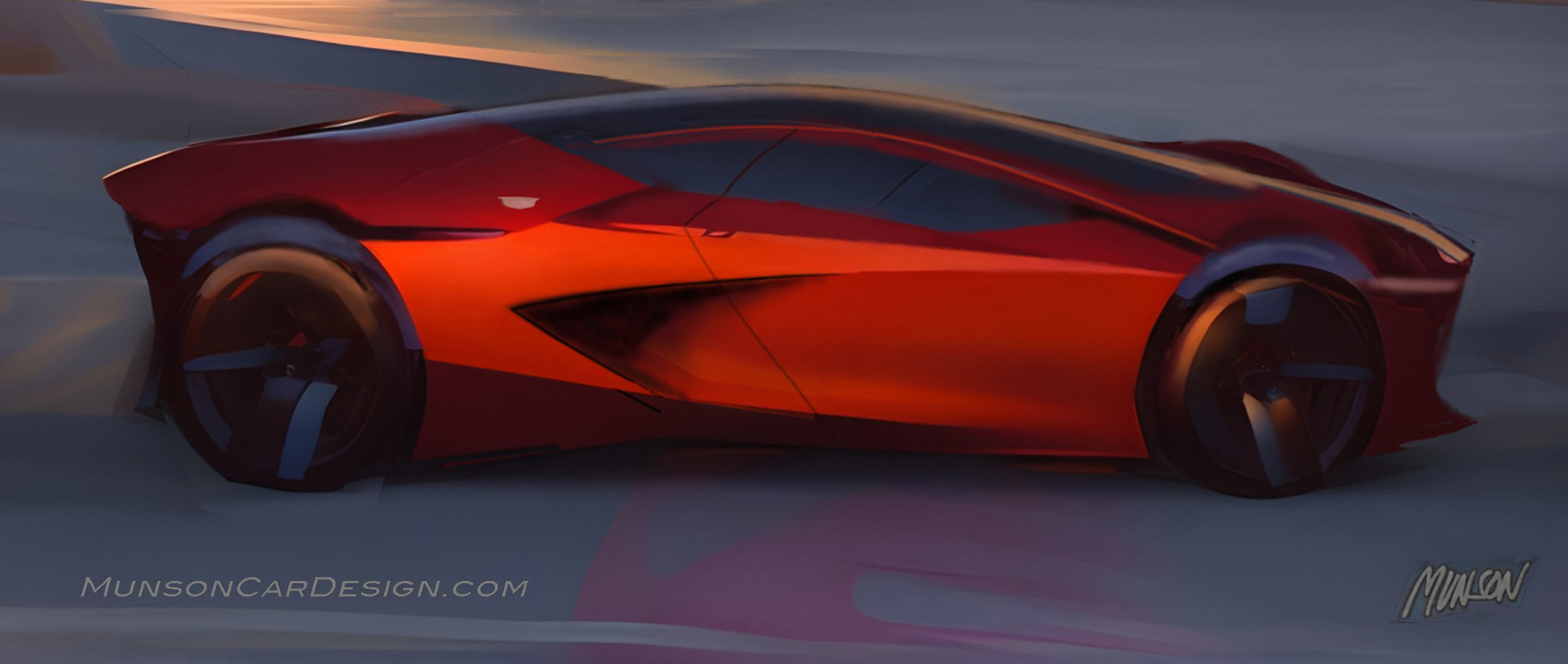
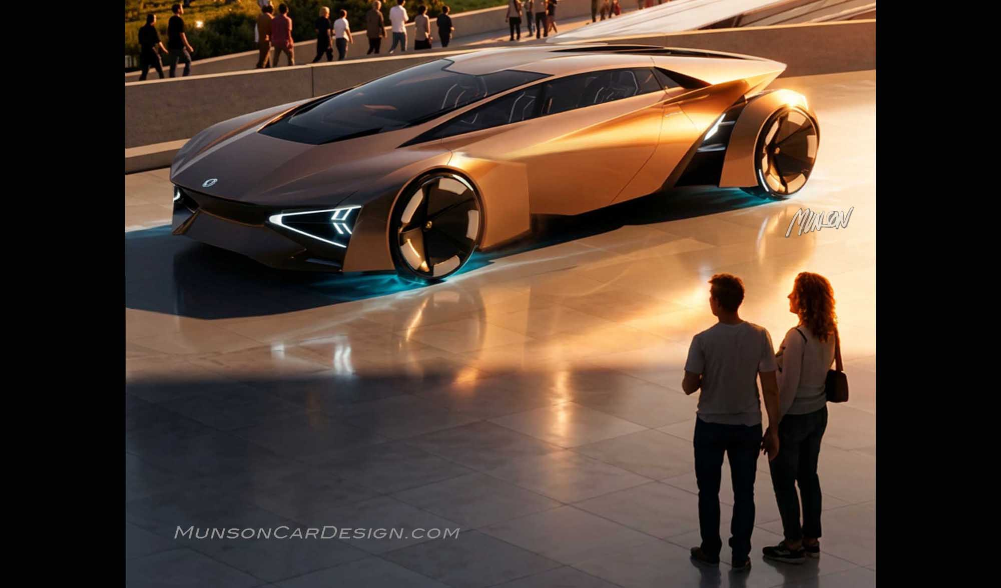
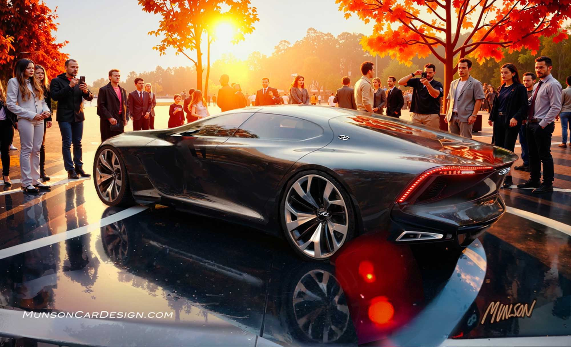
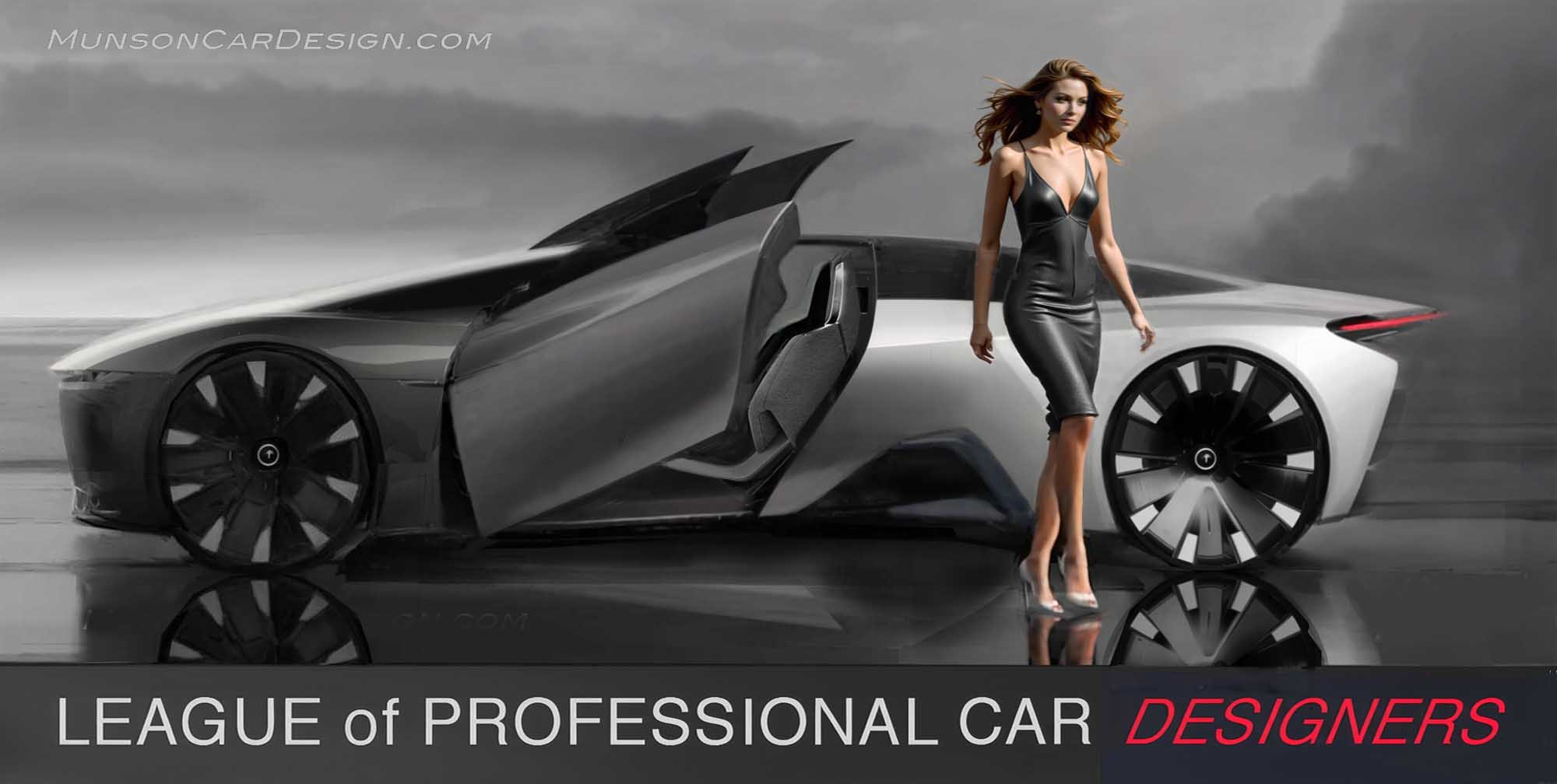
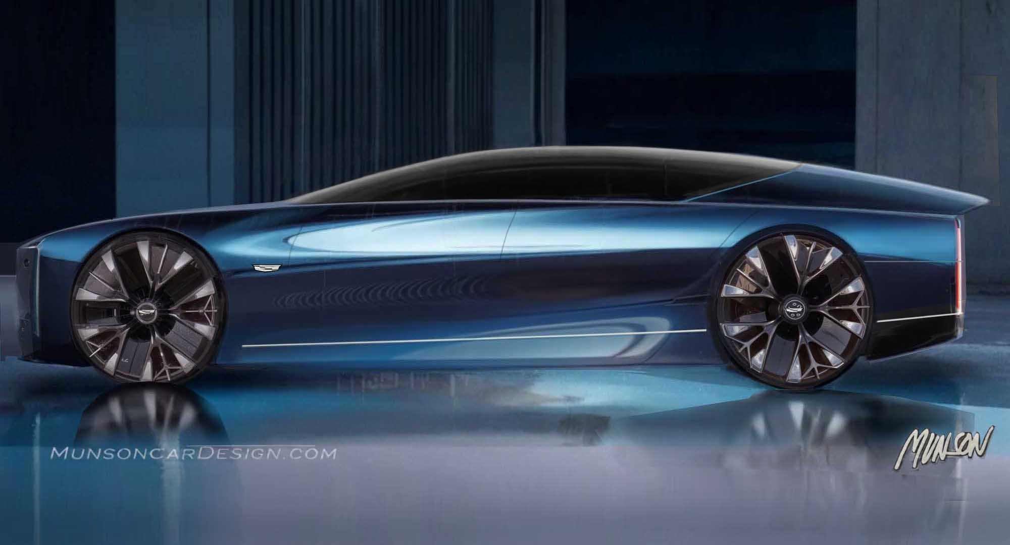
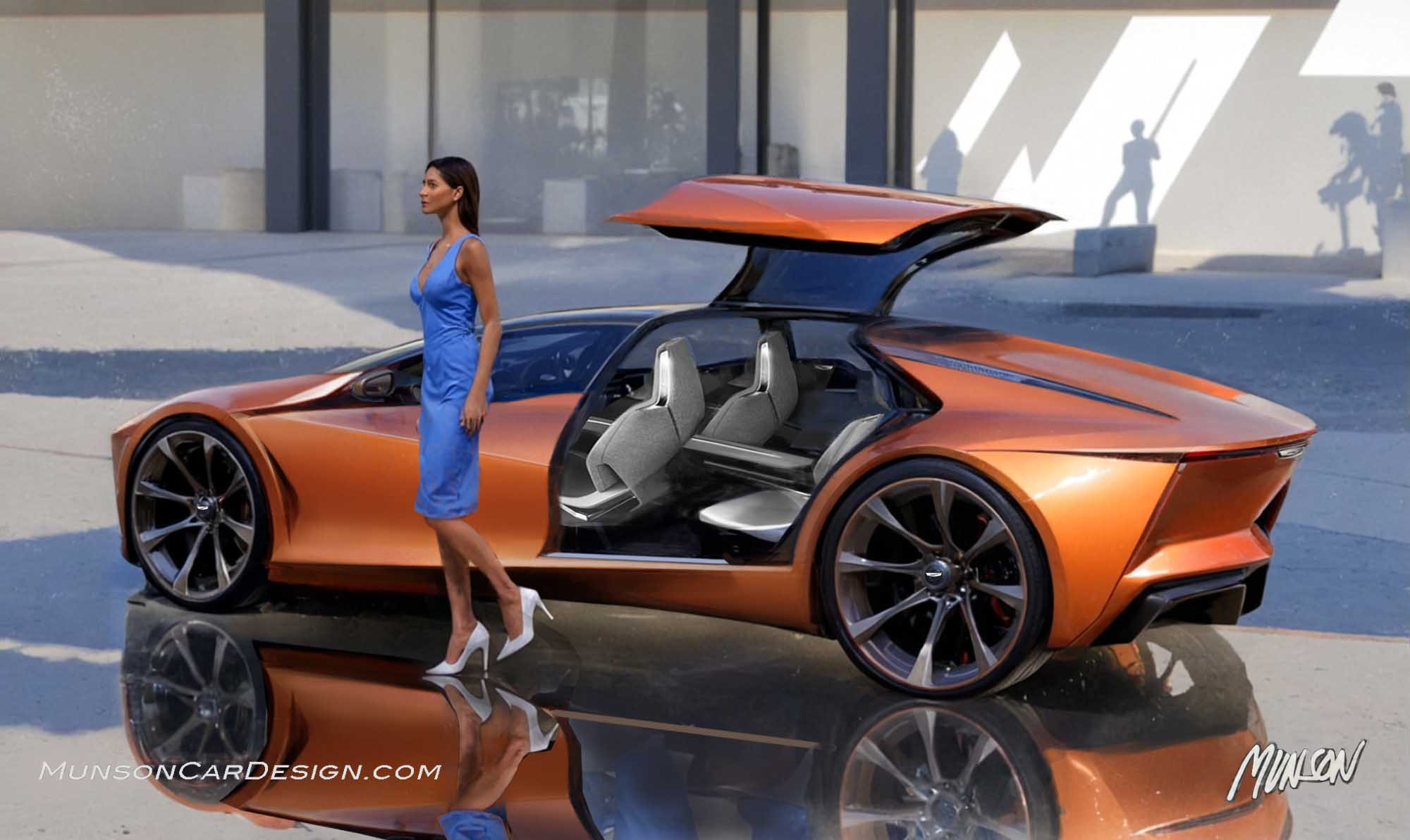
This series of sketches started out as a one box form study that morphed into a mid-engine design. I combined a couple of Vizcom.ai generated images to create the rendering beneath the line drawing. This was actually the last rendering I did for this post.
When I originally applied Vizcom to the initial sketches on the same page, the results were very poor. You get more usable material when you succinctly describe what you are trying to achieve with Vizcom by including the view of your sketch, the lighting you’re seeking, background type, and exterior color.
I applied several hours of Photoshop to refine this design and clean it up. Note how closely the rendered design is to the original rough sketch. Don’t expect Vizcom to do the design work for you, at least not yet.
As I generated more versions, Vizcom kept adding scoops and air intakes to my design, which it has a tendency to do. I decided to pursue this new direction to see where I could take it. It’s easy for a one box mid-engine design to look like a Lamborghini. My goal was to achieve something more original that also looked like a Cadillac. After many iterations and with much simplifying, I landed on the featured rendering.

