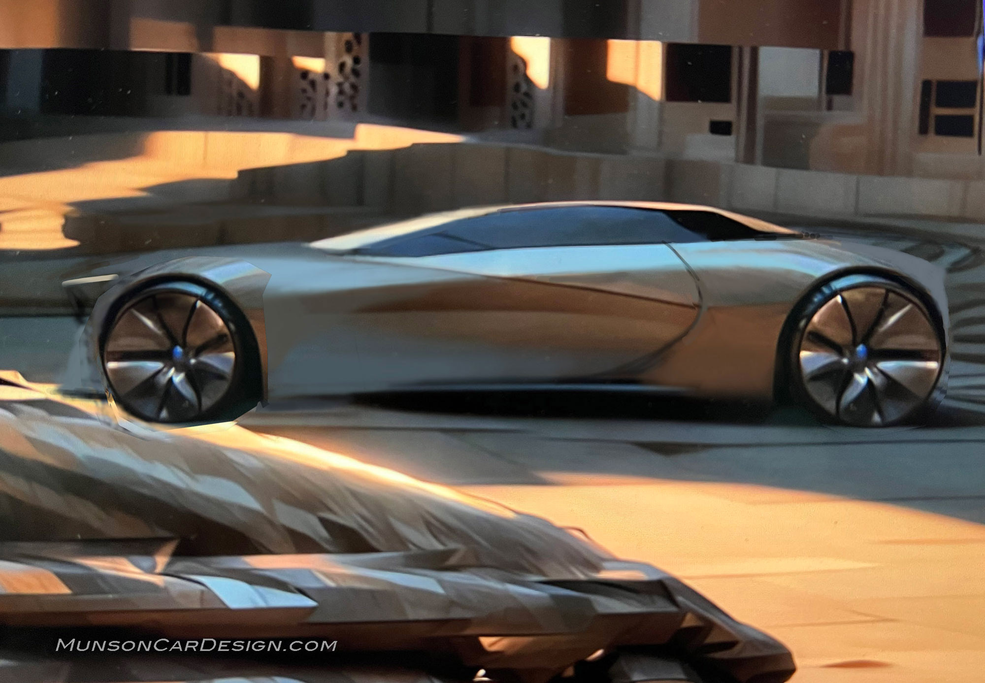
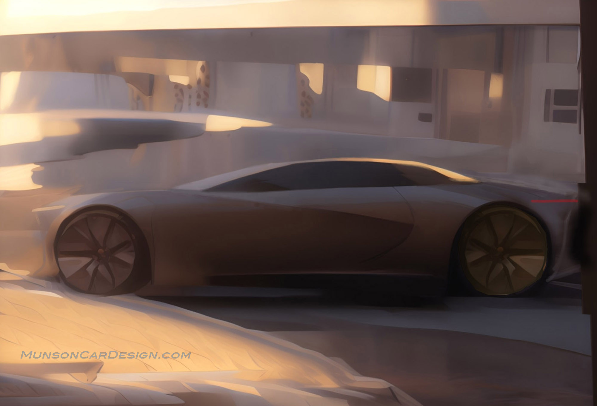
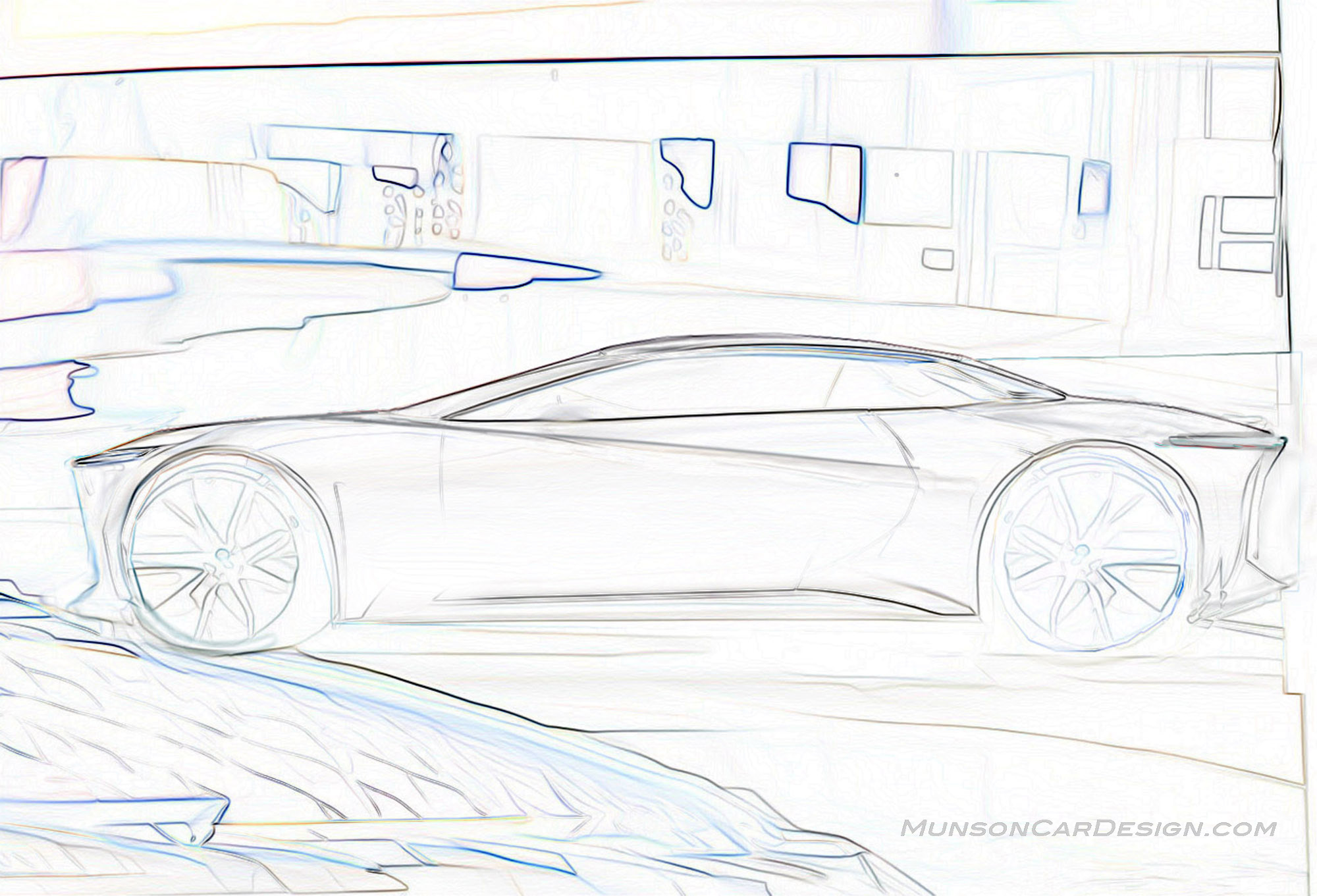
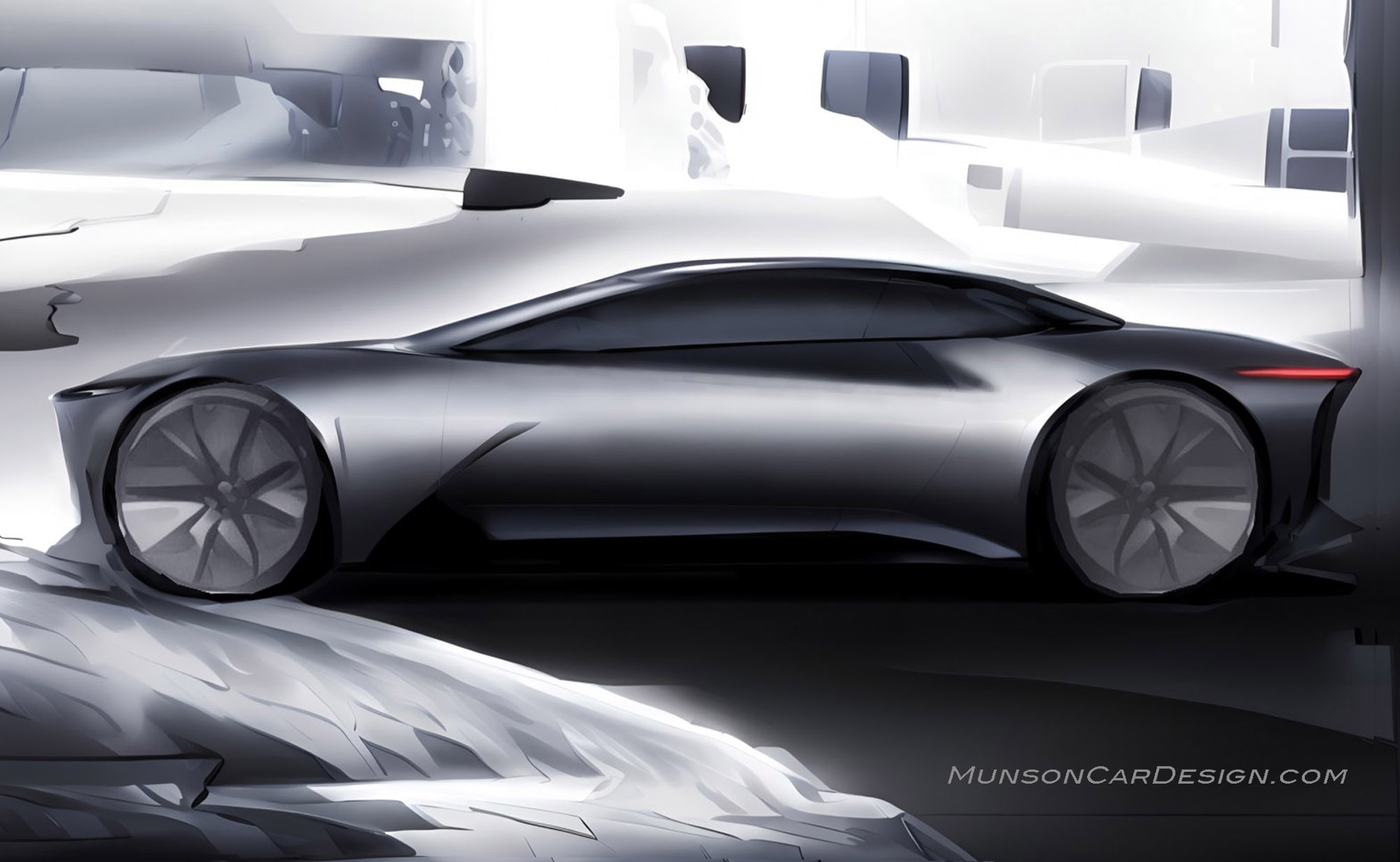
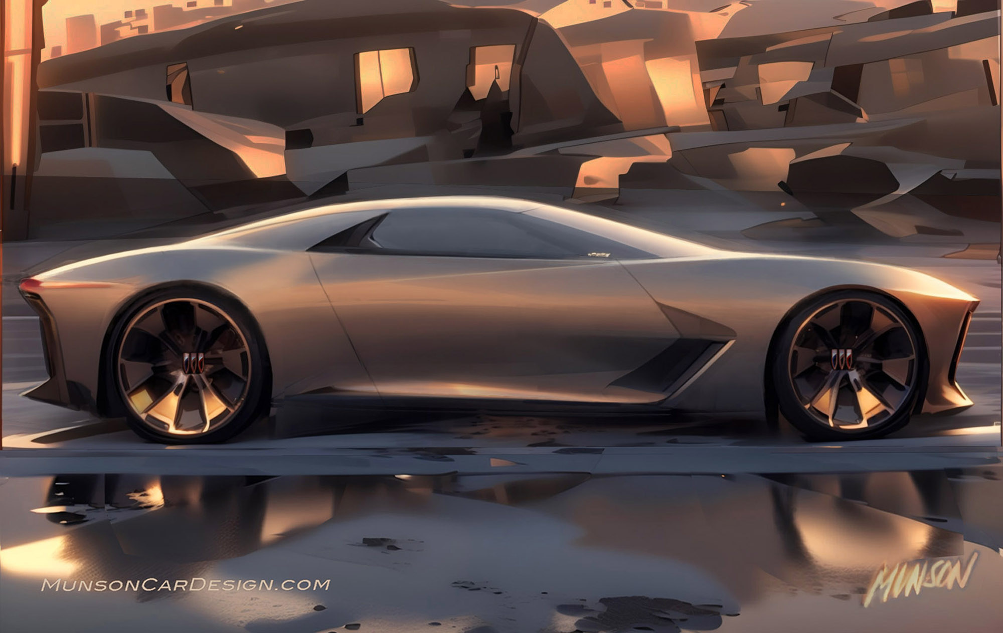
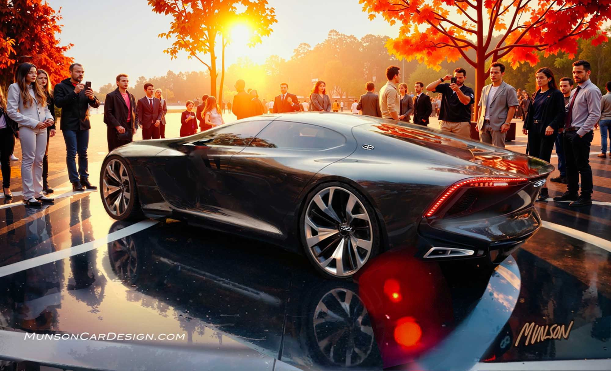
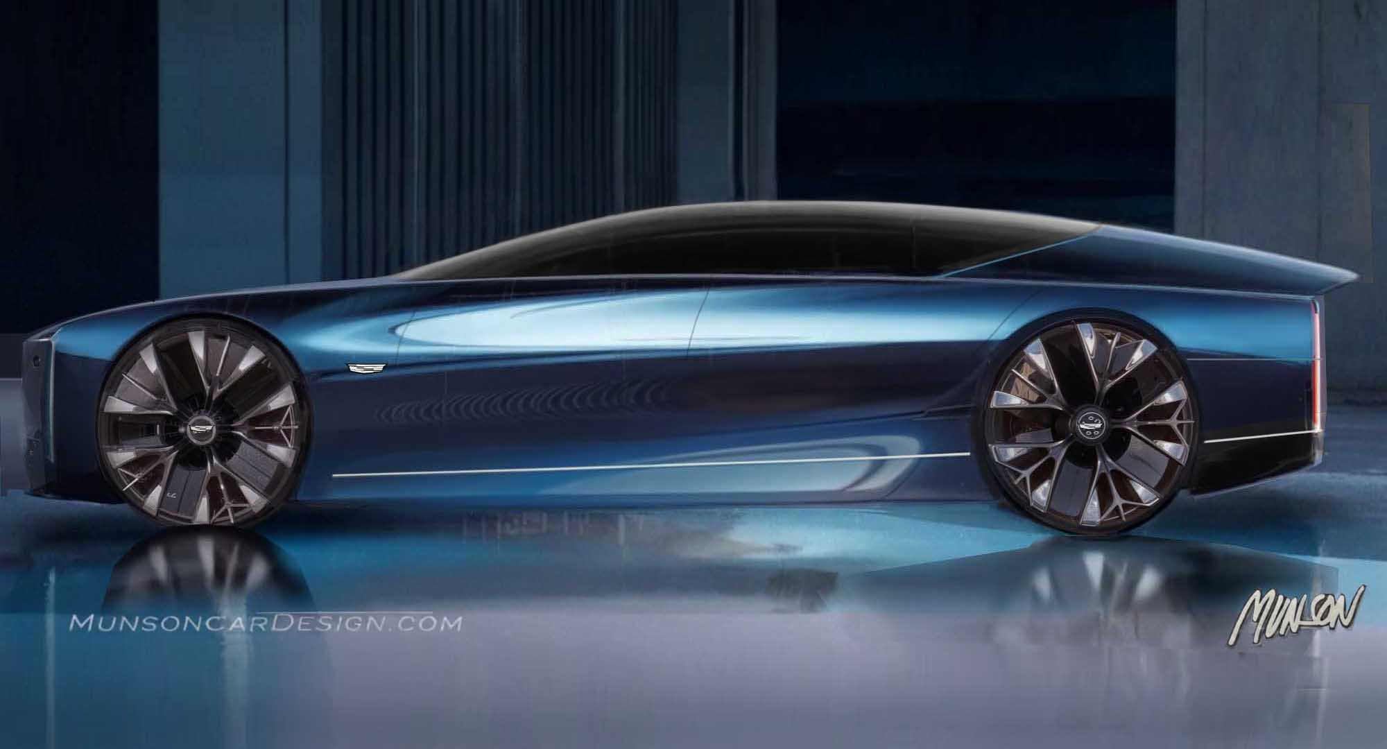
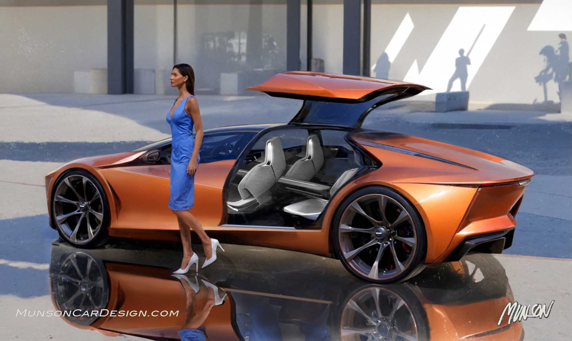
I usually start each post with a pencil sketch. However, this design originated from an abstract car-like shape in the background of a Vizcom rendering I was working on. Much of the iteration work was done in Photoshop. I used the Find Edges filter in Photoshop, then imported it into Vizcom to get the black and white image that influenced the final design. As I’ve gained experience with Vizcom, I’ve become more open to the possibilities of the design solutions it has to offer. I generated many versions of the last sketch in this series with Vizcom using my red Cadillac Vision sedan rendering as a reference to create the featured image. I combined a rear quarter from one version, a front fender from another, a fender vent from a third and Audi wheels to create the look I was after.
As the design evolved, I wasn’t sure which brand it should be. I shared my early sketches with a friend who felt strongly that it looked like a Buick. I’ve always admired the 1967 Buick Riviera which has romantic flowing lines and the 1963 Riviera with an upper that looks like a hardtop convertible. I channeled those two designs into my theme. My mindset was to achieve an expressive statement that reflected the optimism of 60’s era styling which I loved as a kid. I emphasized the dropped belt which is a design cue from the late 70’s, early 80’s. I was going for 60’s nostalgia but with a modern vibe. I like to think that Bill Mitchell would have approved of the styling.
