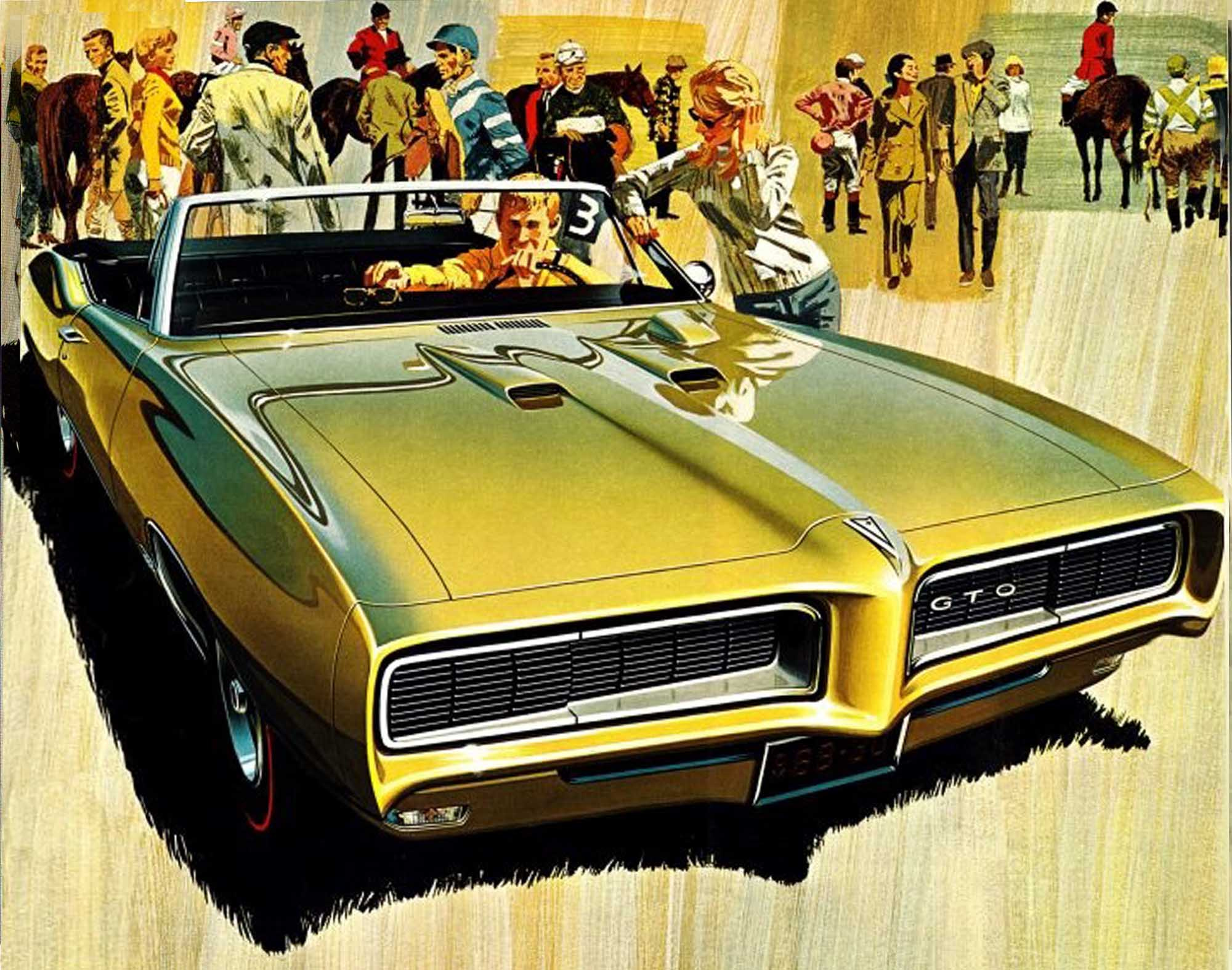
The inspiration for this series of sketches came from a motorcycle fairing and the AF/VK Pontiac GTO rendering .
I’ve always admired the advertising artwork of Art Fitzpatrick & Van Kaufman. The gorgeous illustrations had backgrounds just as important as the cars depicted. My favorites are the 60’s Pontiacs. I love the wide angle views.
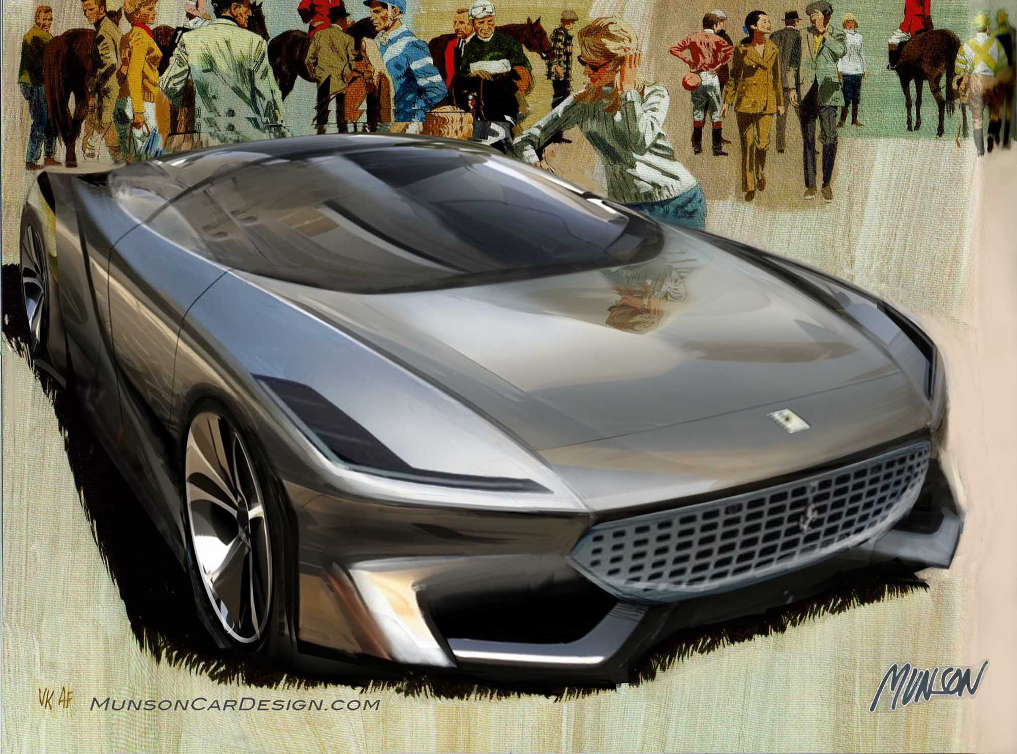
I crudely sketched over the fairing in Photoshop then put it in Vizcom. I clipped each panel of the Vizcom rendering separately and re-proportioned them on the AF/VK artwork. I tried to use perspective in Photoshop to do the exaggerated view but that didn’t work for me. Notice that the ladies arm leaning on the Pontiac is lower on my design since I cheated the height.
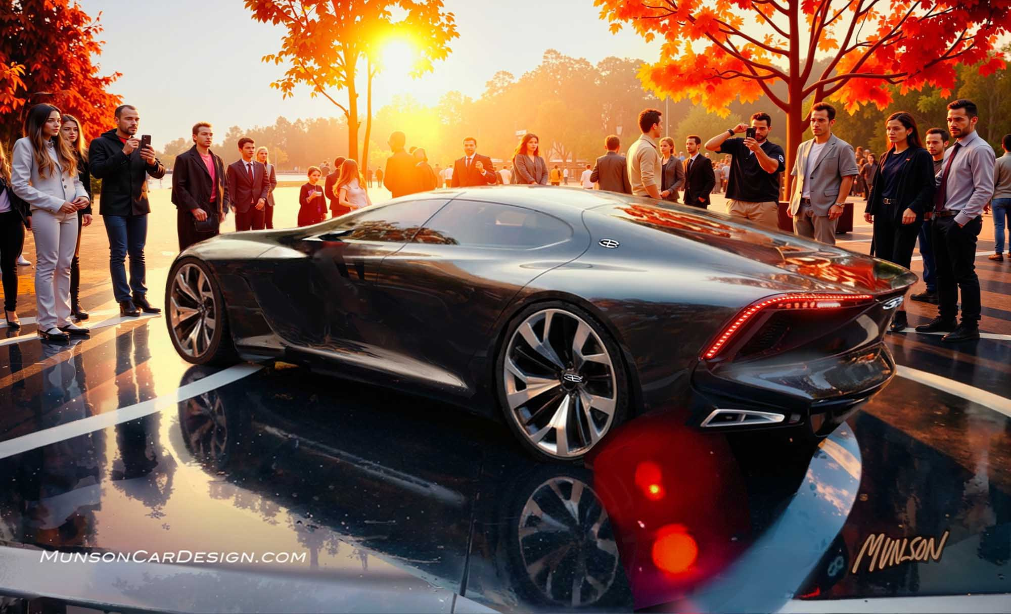
I didn’t know what brand to make my design until the first Vizcom sketch was finished. A Ferrari grille fit nicely so I used it. When I re-generated the rendering in Vizcom, I decided to rebrand it as a Buick. The soft shapes and curving lines fit nicely with the Buick brand character.
I used the same chrome reference image in Vizcom as in my last post. I’m not into chrome cars, but I love the dramatic results that you get with Vizcom.
Vizcom turned the lady leaning on the car into a robot. I added more detail to put more emphasis on her/it.
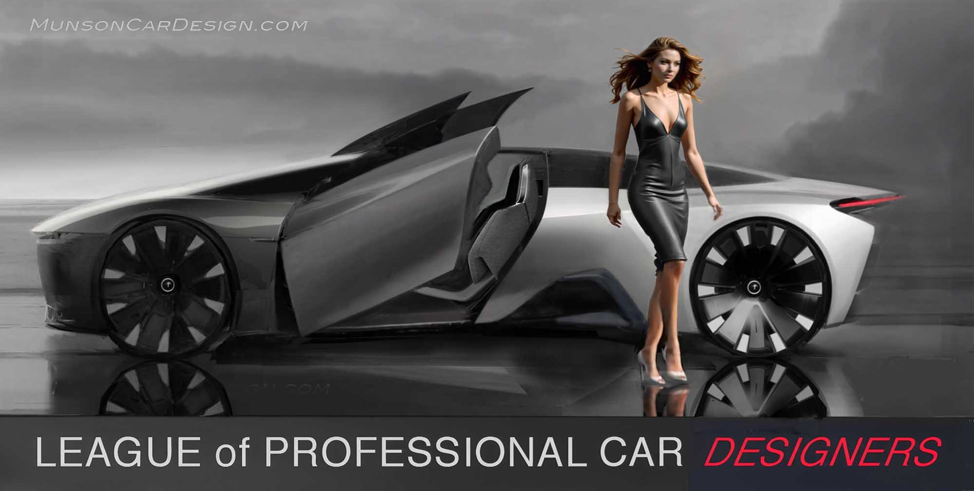
The glass roof/windshield swings forward in this concept.
If you use Photoshop with Vizcom, I recommend varying the opacity of the clipped Vizcom layers in Photoshop. For example, I may take 2 hoods that I like in Vizcom and vary the opacity of one overlayed on the other to get the results I want.







2 Responses
Great design Bob
Beautiful job!!!