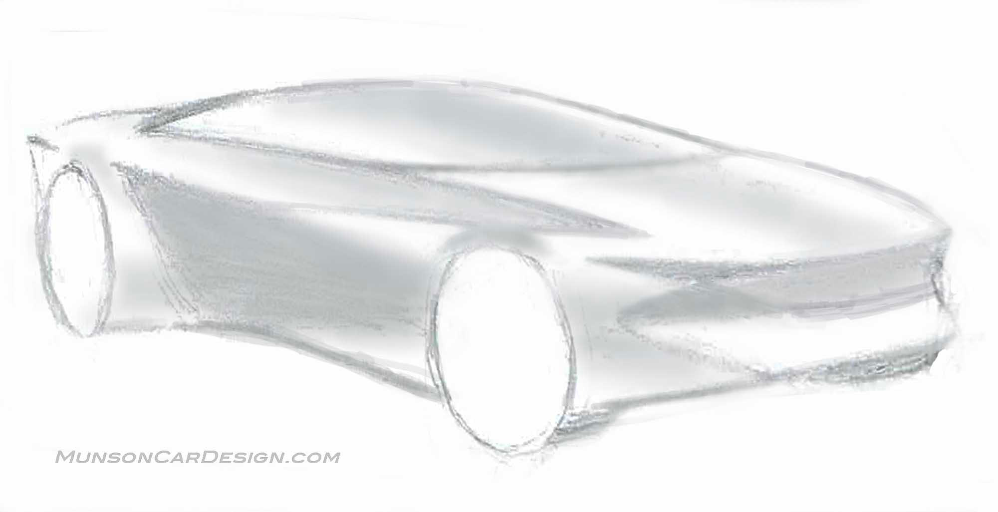
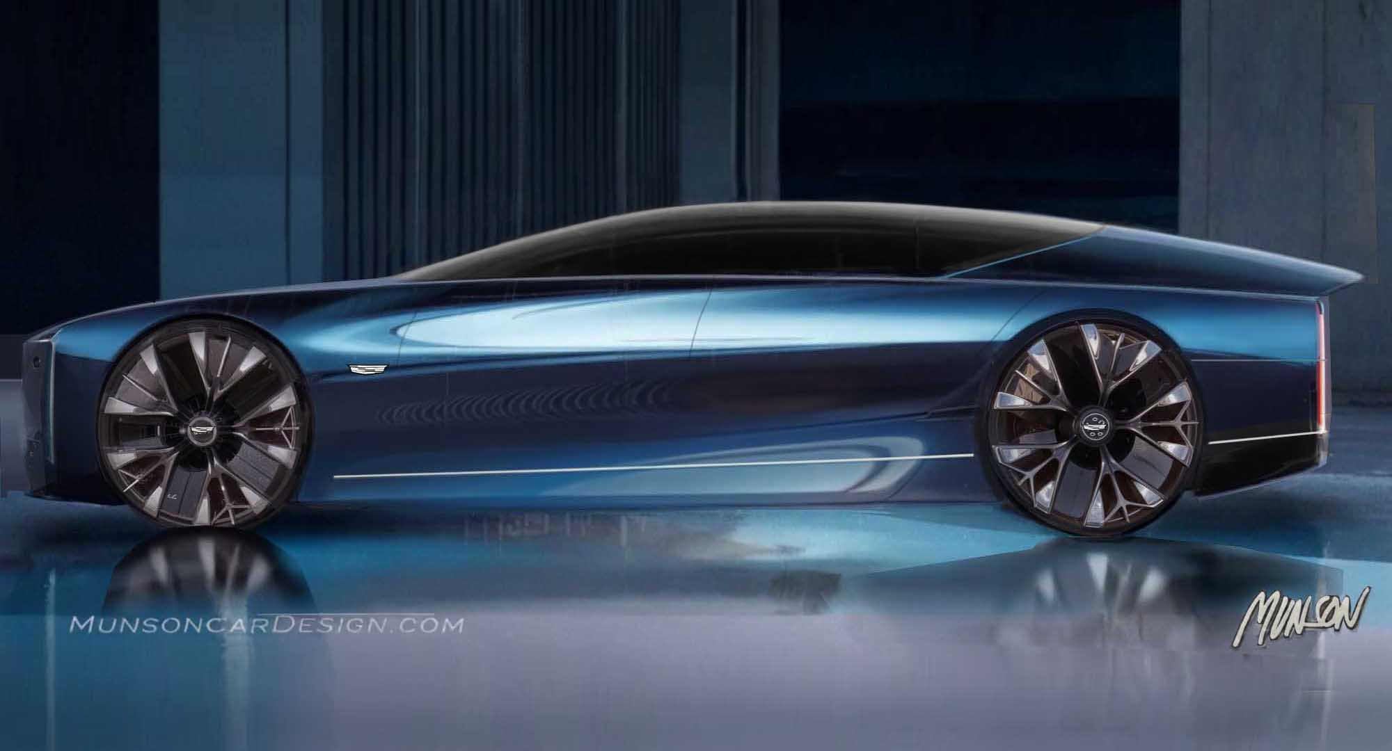
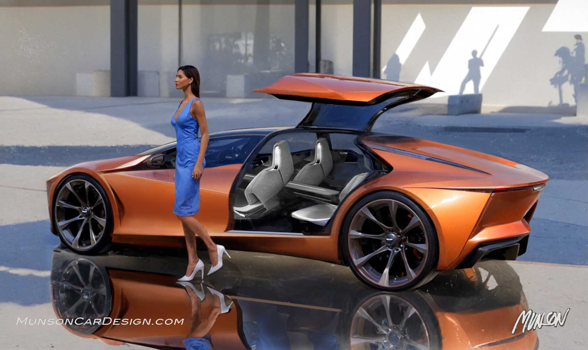
This design evolved quite a bit from the original sketch. I was intrigued with the body side having a combination of creases and soft forms.
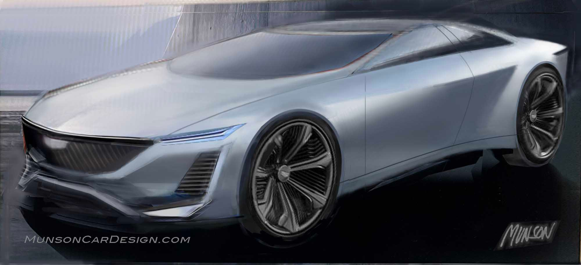
I worked out the design in Photoshop over another sketch with a view that I liked.
Once I decided that it would be a Cadillac, I focused on creating a modern face with sculptural flowing shapes.
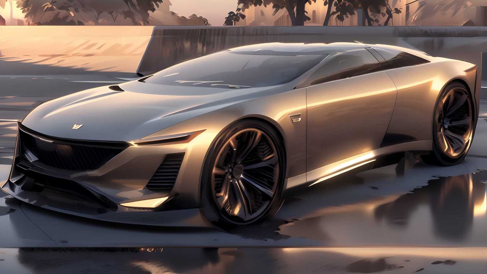
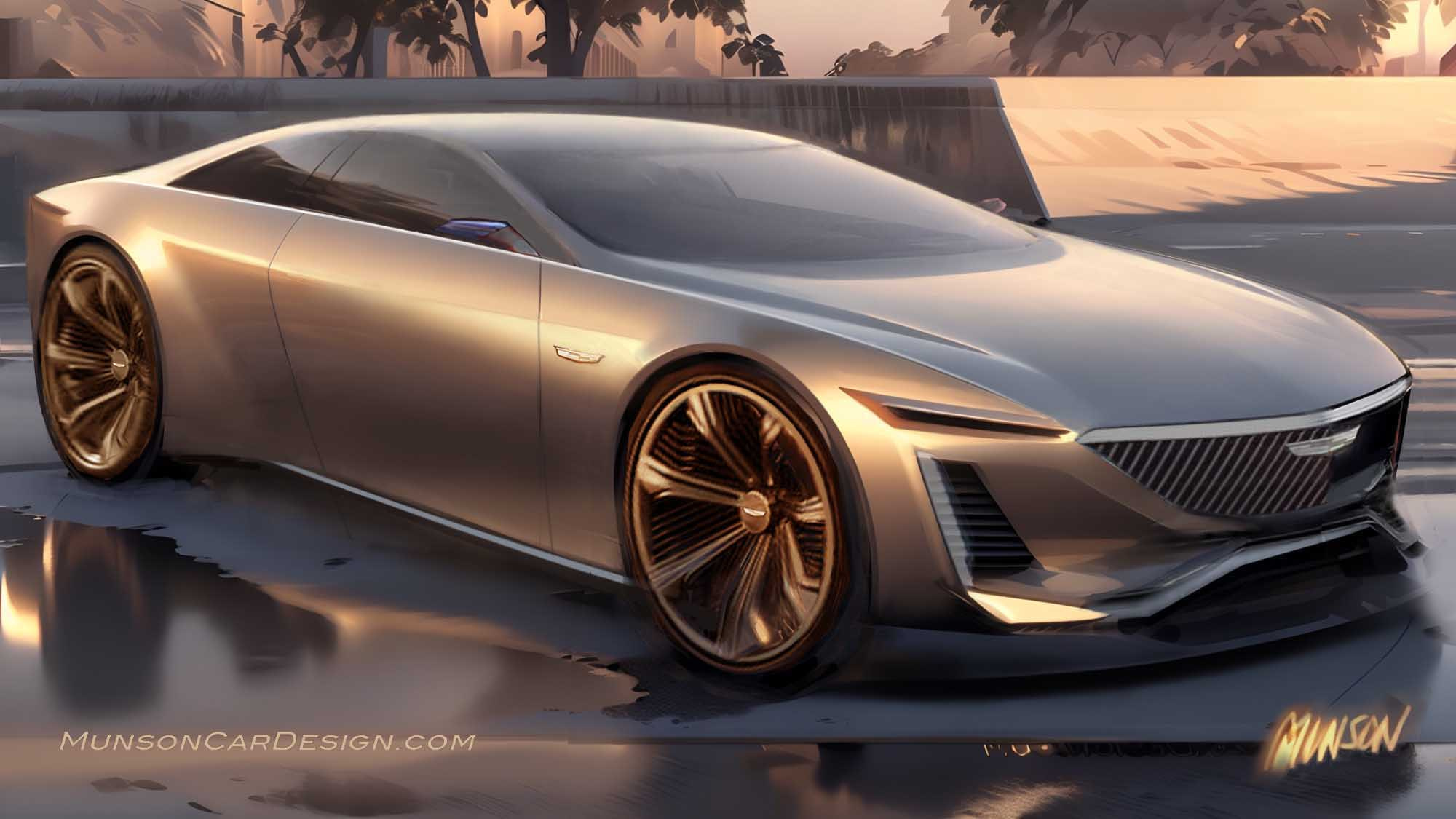
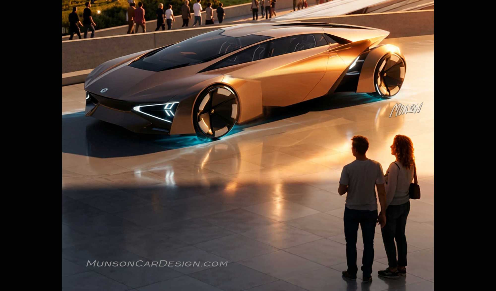
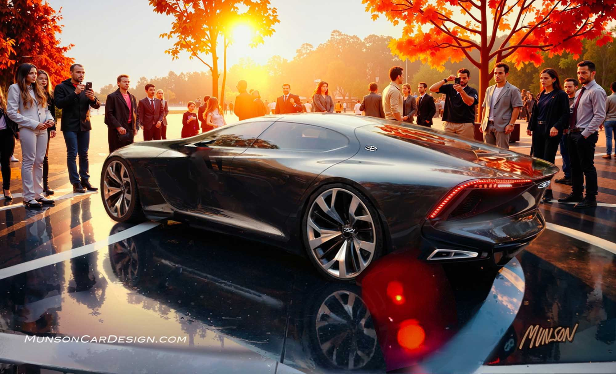
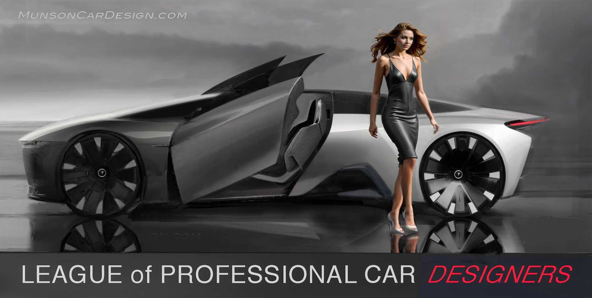
The next to last rendering in this post was the Vizcom generated image I chose out of about 30 to work in Photoshop. 109 layers later I had the last sketch. I still wasn’t satisfied with the result, so I generated 12 more Vizcom images to get the featured image after mild Photoshopping.
I deliberately widened and lowered the Cadillac emblem in the grille. I know it’s not brand character, but it just looks better.



2 Responses
It really is amazing what you can do with Photoshop. The rendering looks so real ! Great stuff !
Don
Pretty sweet. I think the understated bodyside section us superb. Front view dynamic with caddilac vibe. Powerful.
The DLO is strong.
Extremely refined. I would have given
That last part of roof just a touch more
Thicknes…not much. Just a touch.
Design is production ready. Totally outstanding.
I Agree with Dick Ruzzin…GM should have never let you get away or retired
Hah hah