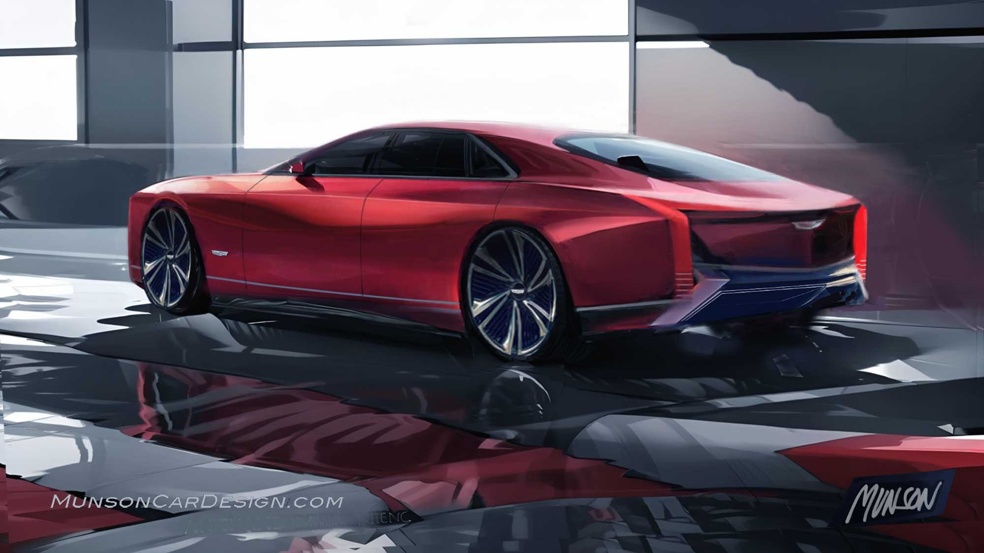
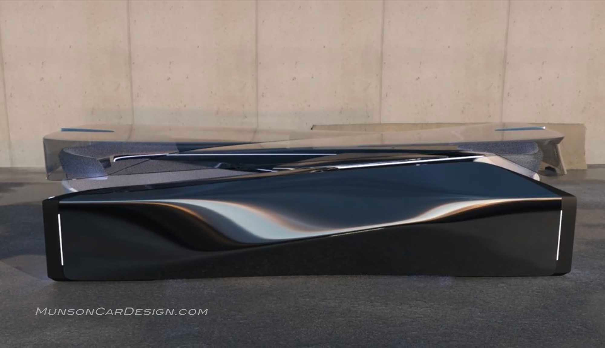
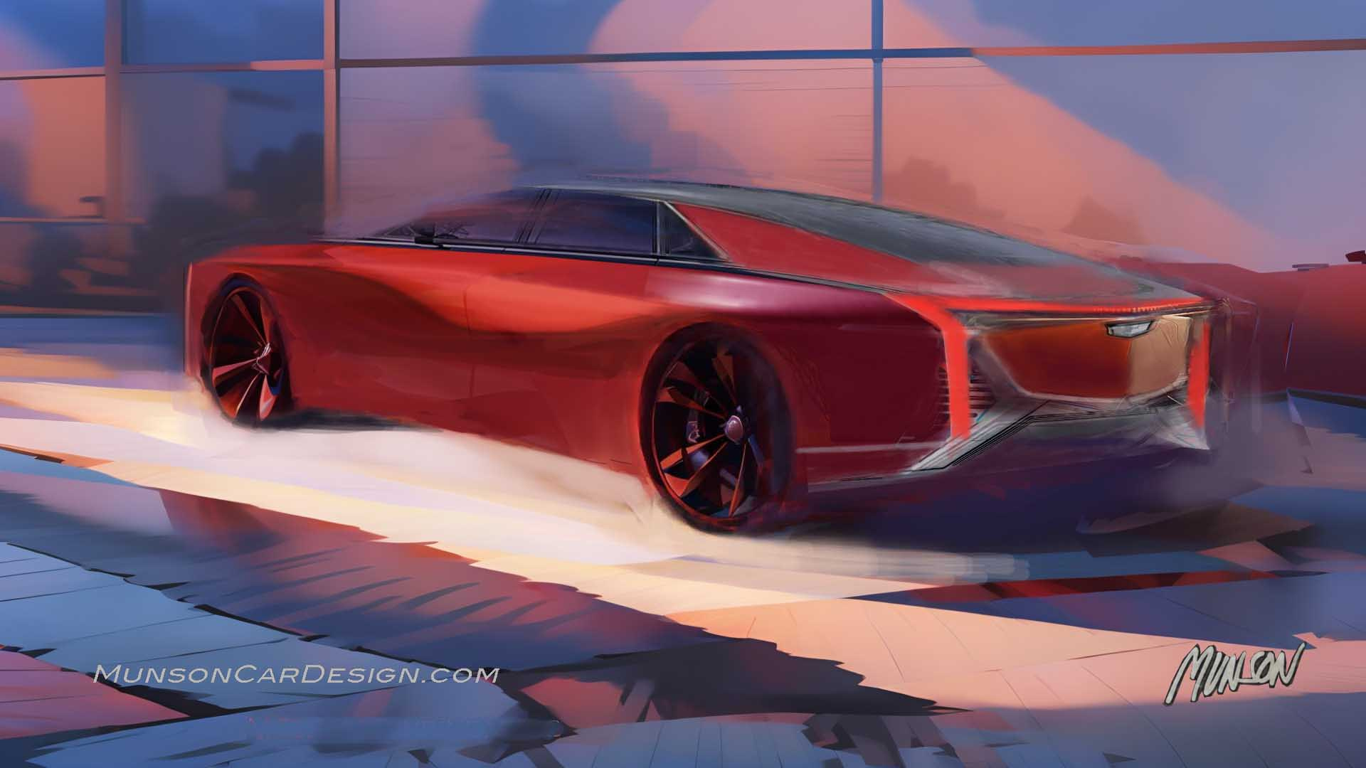
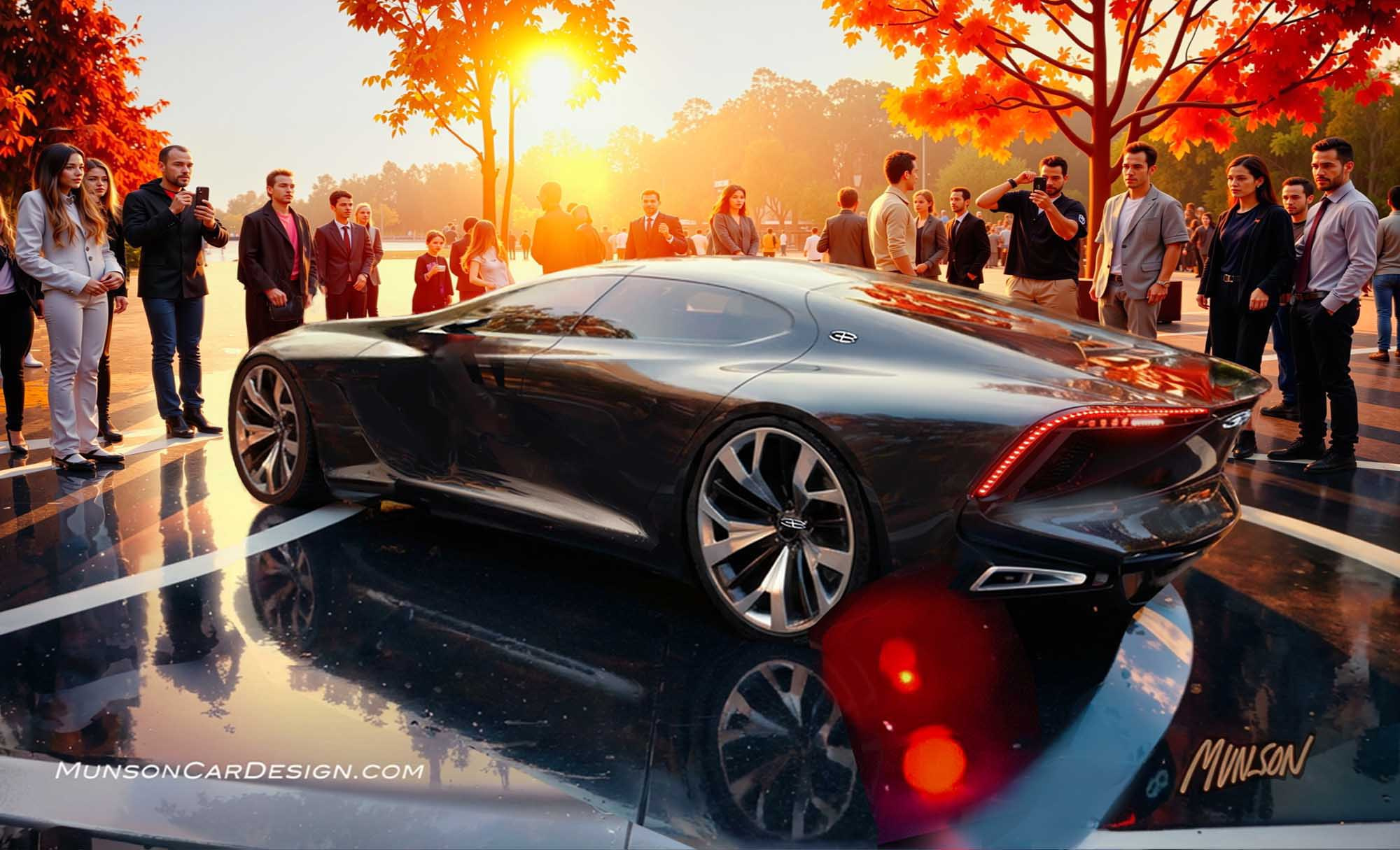
The inspiration for this design came from an image of a shape I found on Behance.com. I wanted to see what I could design based on the body side reflections in that rendering.
I like the Cadillac Celestiq design that I saw in the GM Design dome when I visited there this past summer for the retiree event to tour the new Design West studios. But I’ve always wanted to design a flagship, top of the line Cadillac that has very sculptural surfacing with juicy reflections. It’s so much fun to sketch these proportions too.
I normally wouldn’t follow two rear 3/4 view posts with the same view. But my early sketches were compelling enough to continue.
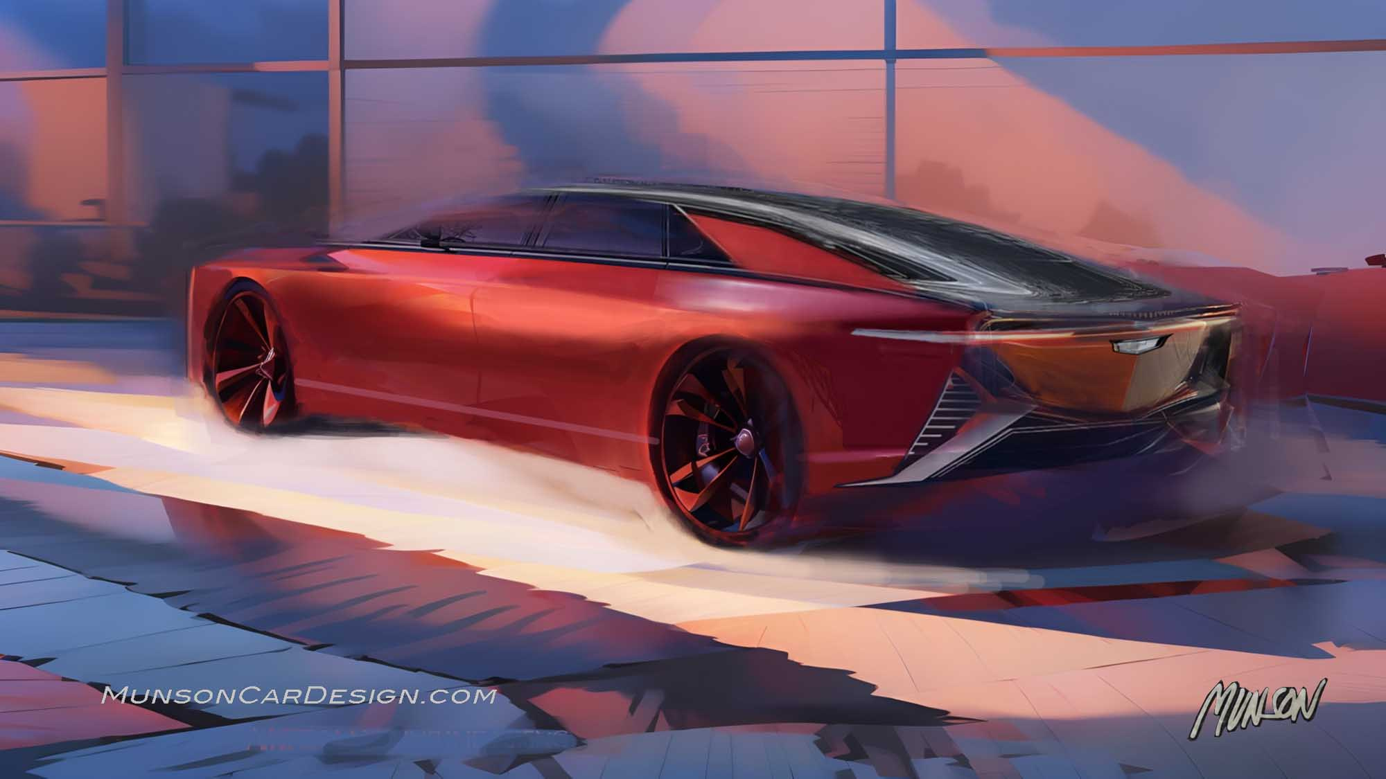
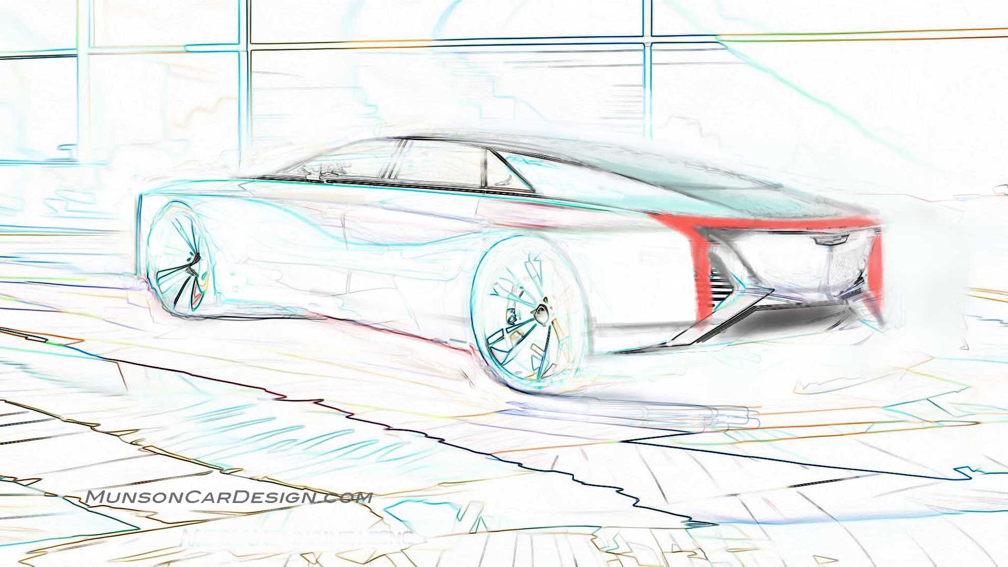
Instead of starting with a pencil sketch, I drew over a previous design in Photoshop and imported the inspirational shape image over the body side. I already had the fast sail panel and tail light shape in mind. I reduced the sketch to only lines with Find Edges in Photoshop to make quick changes. I then imported it into Vizcom and selected Pastel Rendering style. Sometimes I get better results in Vizcom by starting with line drawings.
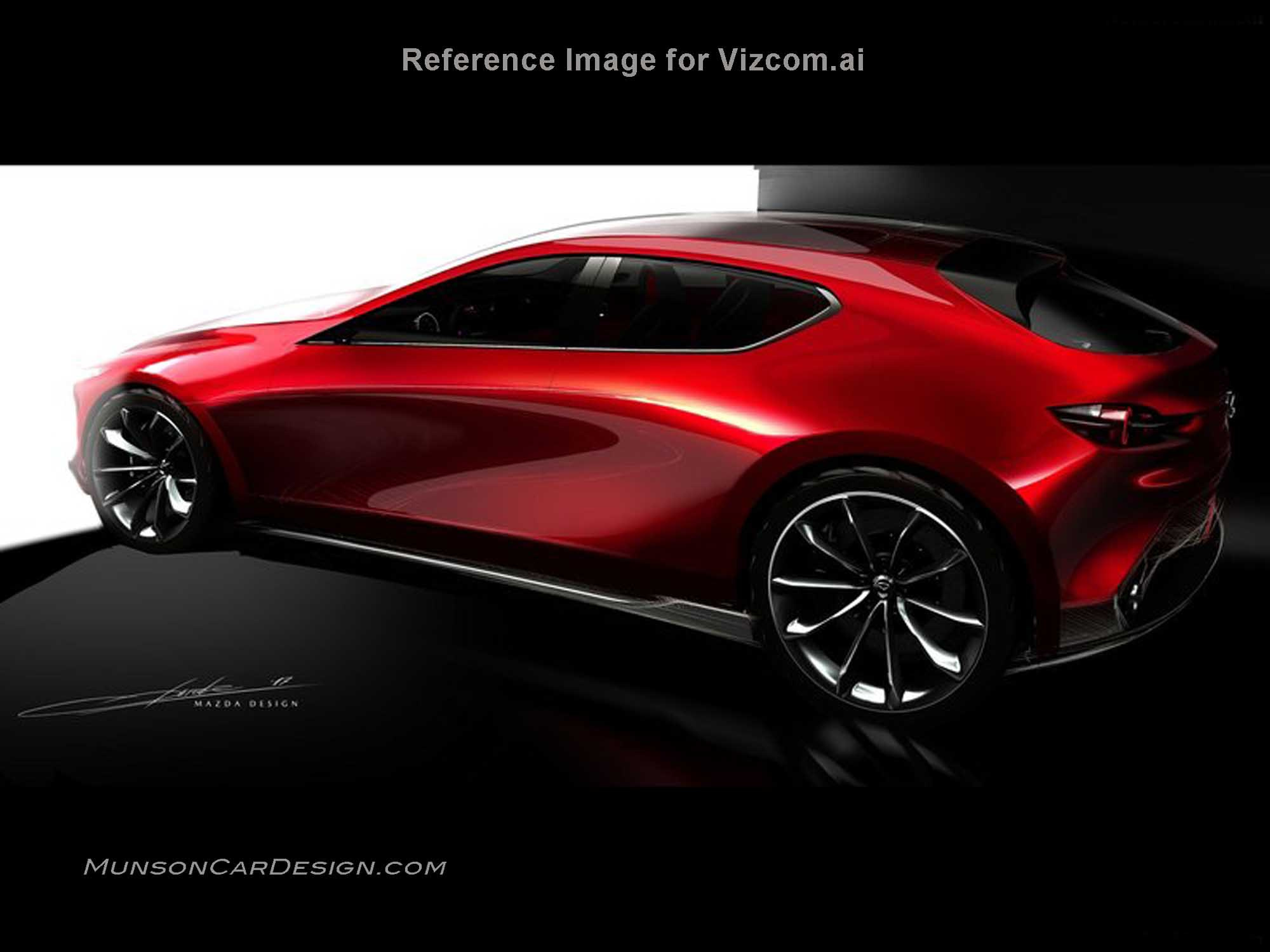
I included the Mazda rendering I used as a reference image. I can’t emphasize enough the importance of using a good quality reference image to get great results with Vizcom.
I was going for a timeless classical design that is graceful and elegant. My early designs were very sporty. They reminded me too much of current Cadillac designs. I feel the final design is unmistakably Cadillac and couldn’t be confused with any other brand.

