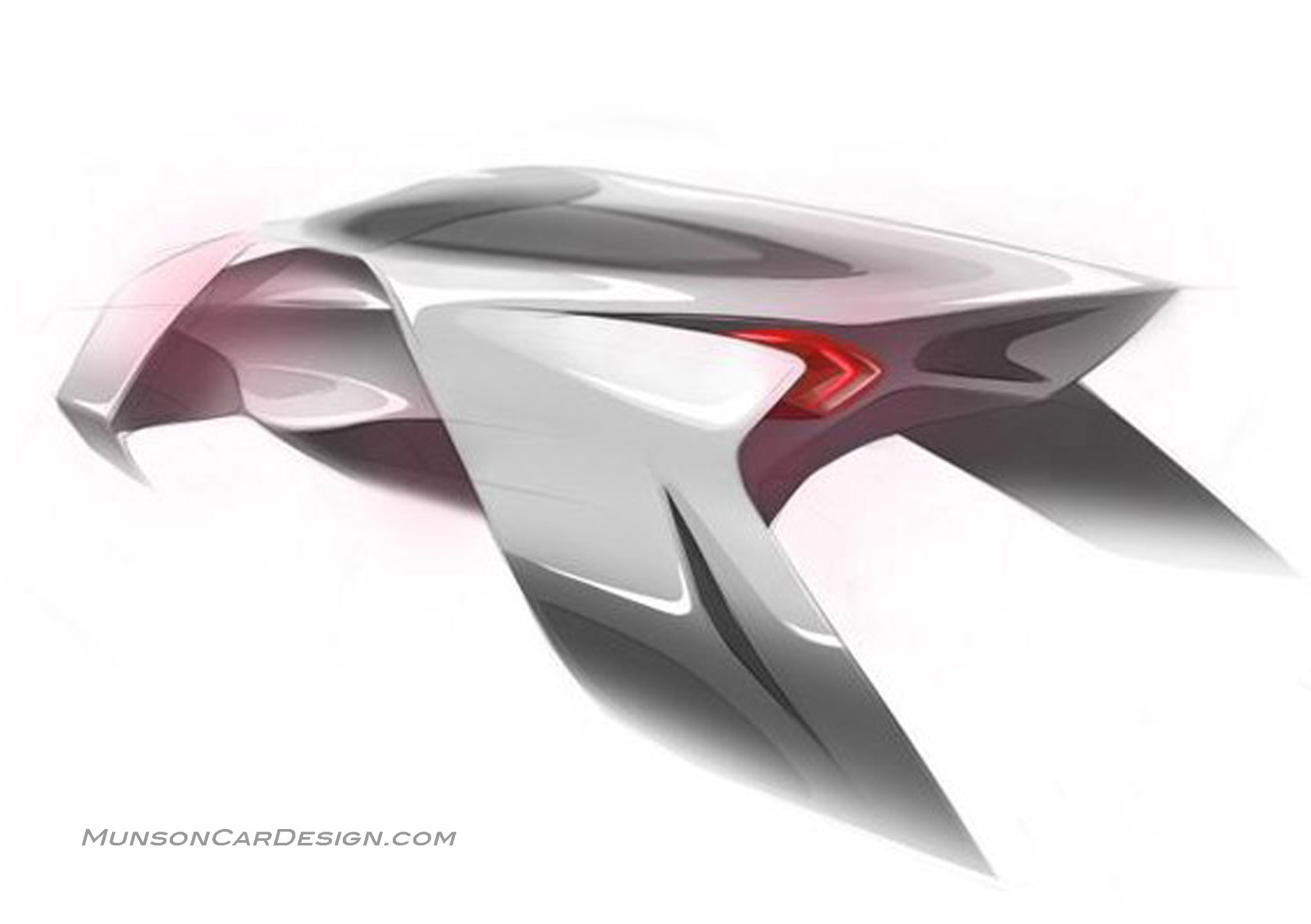
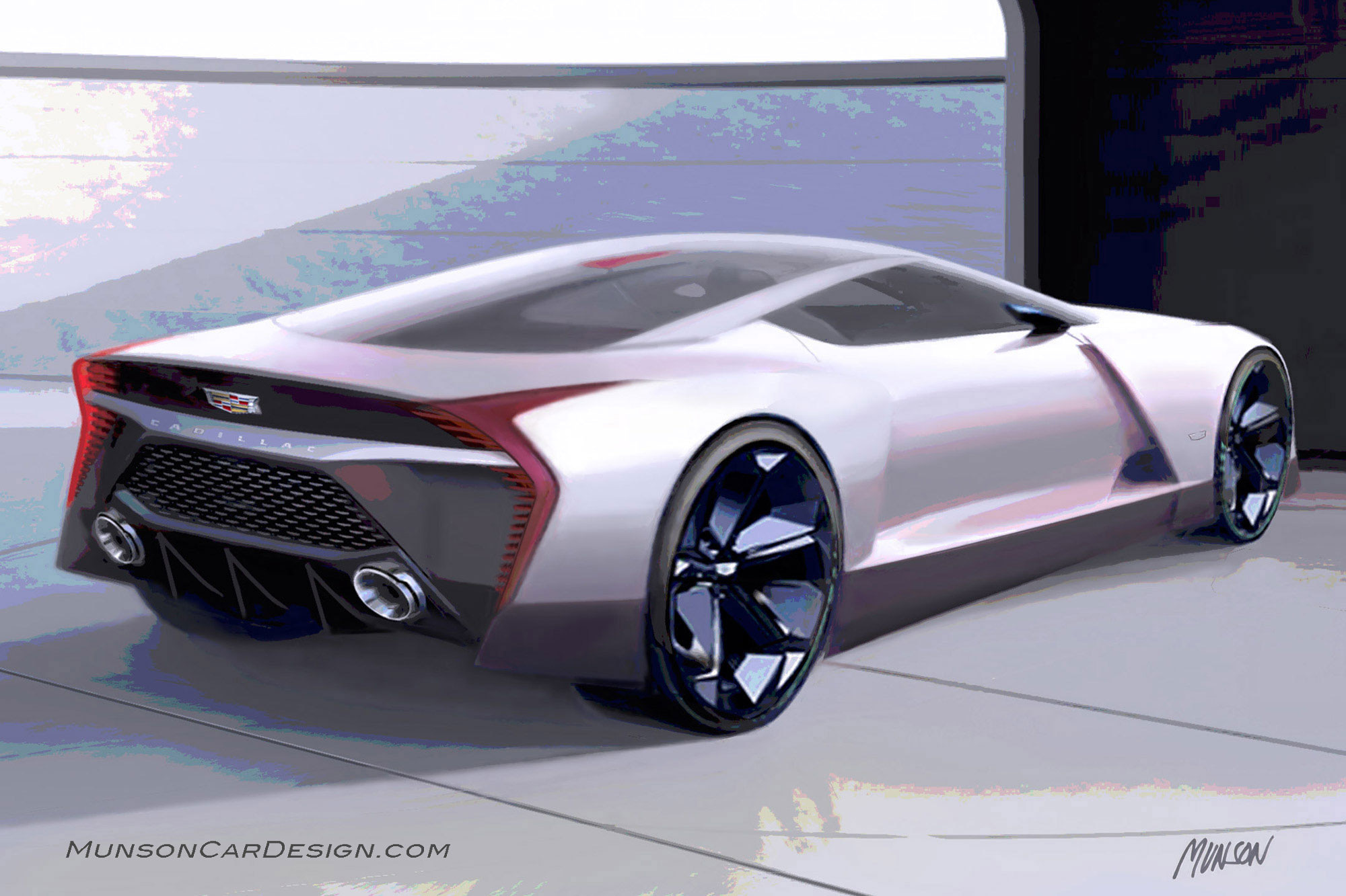
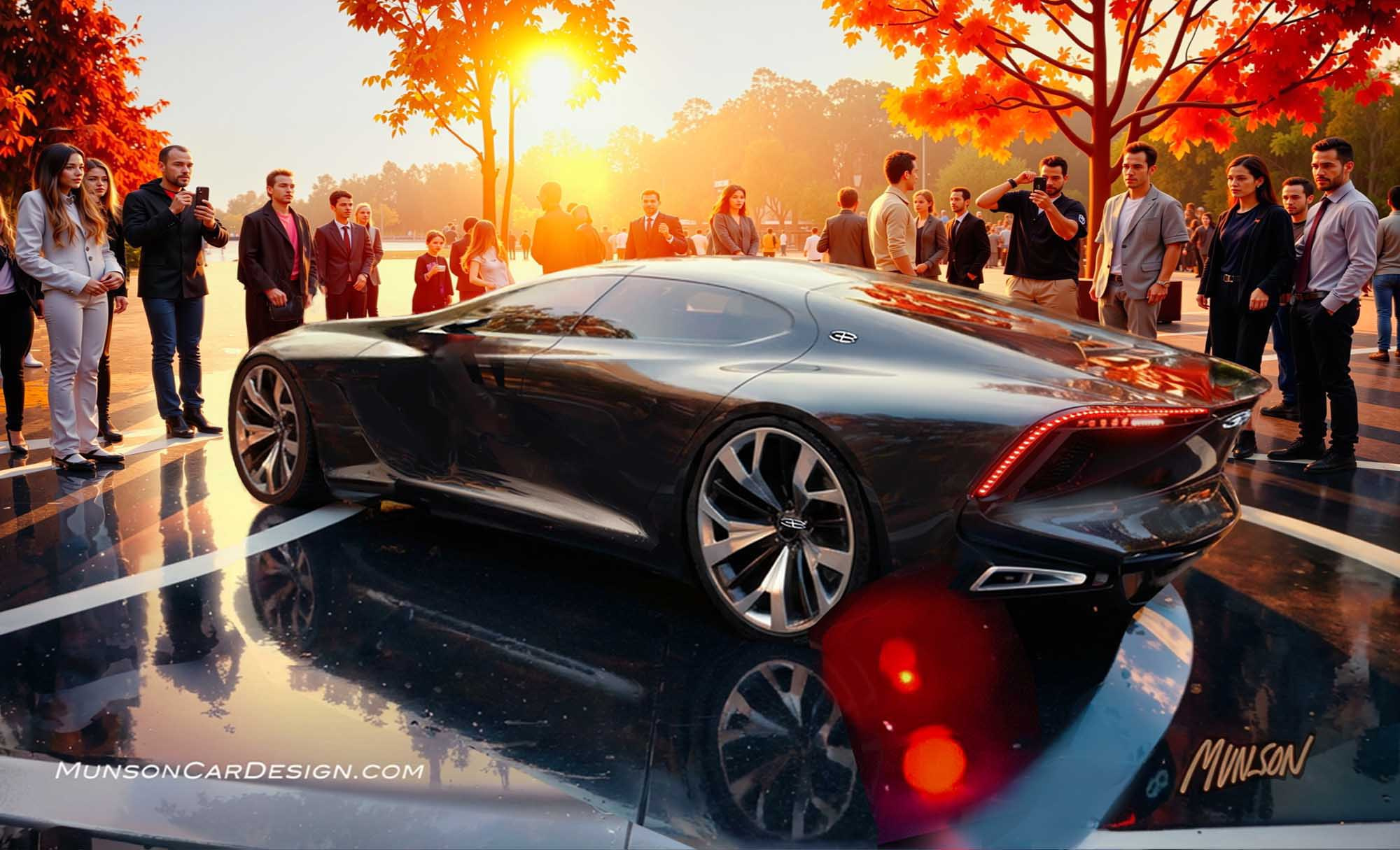
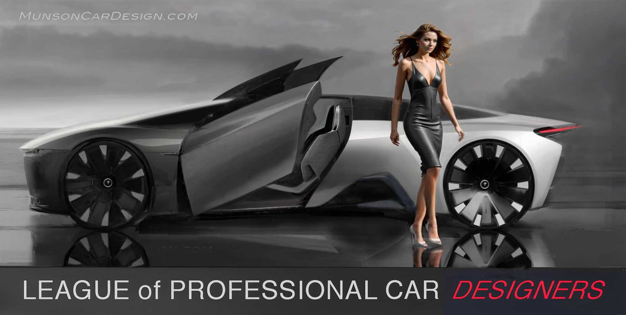
I’ve been working on and off this sketch over the past year. I was inspired by the shapes in the aquatic vehicle sketch.
I wanted to create a very expressive design that was retro and modern at the same time. I violated Cadillac brand character by not implementing a spline feature through the length of the body side. I feel the design has enough tautness in the surfacing to be unmistakably a Cadillac.
The rear went through many iterations until I simplified it and related it to the front fender. I sought to create a distinctive tail lamp light signature that would be recognizable from a distance and uniquely Cadillac. I had GM car designs from the 60’s in mind for the rear with their unique and varied styling solutions.
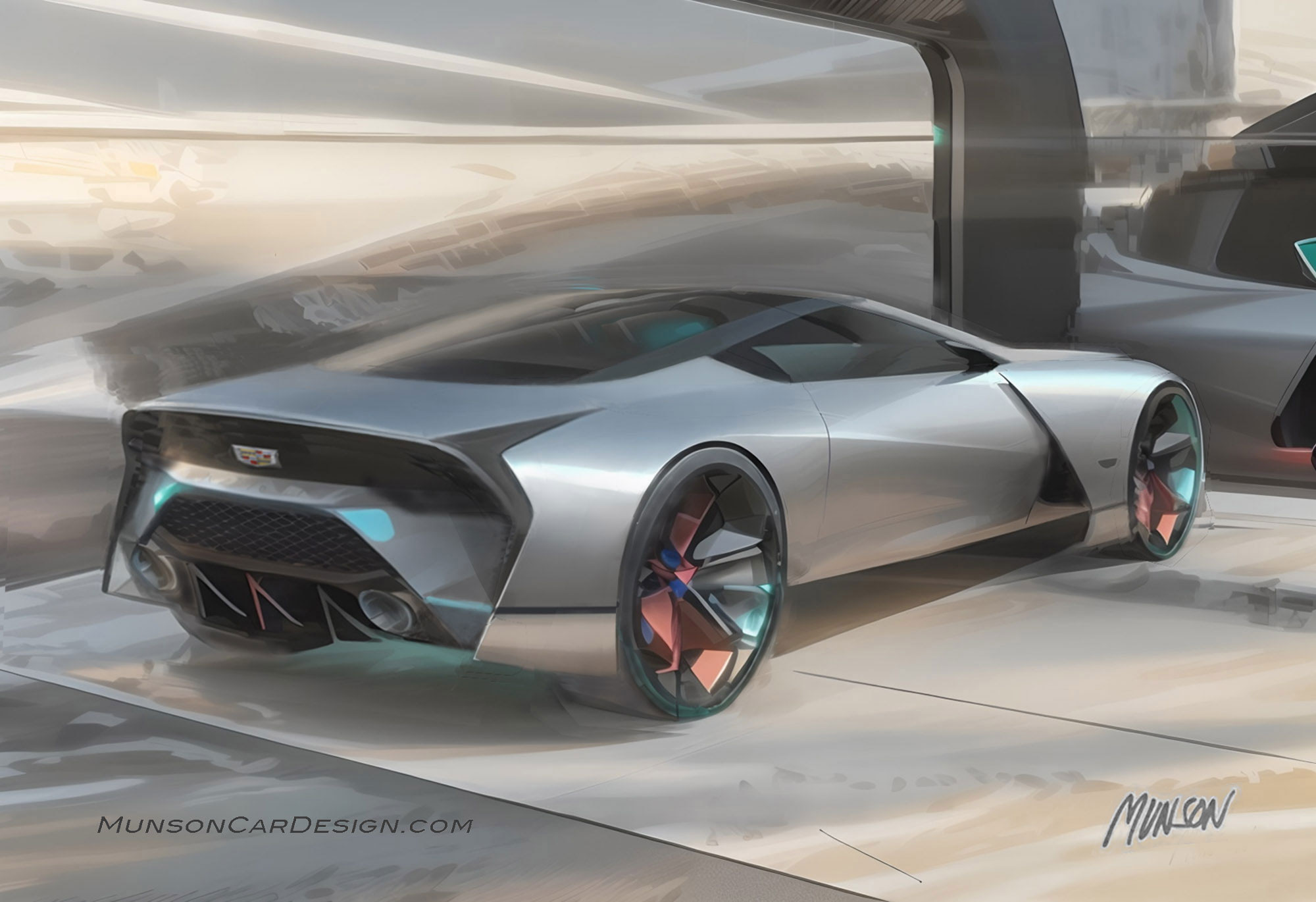
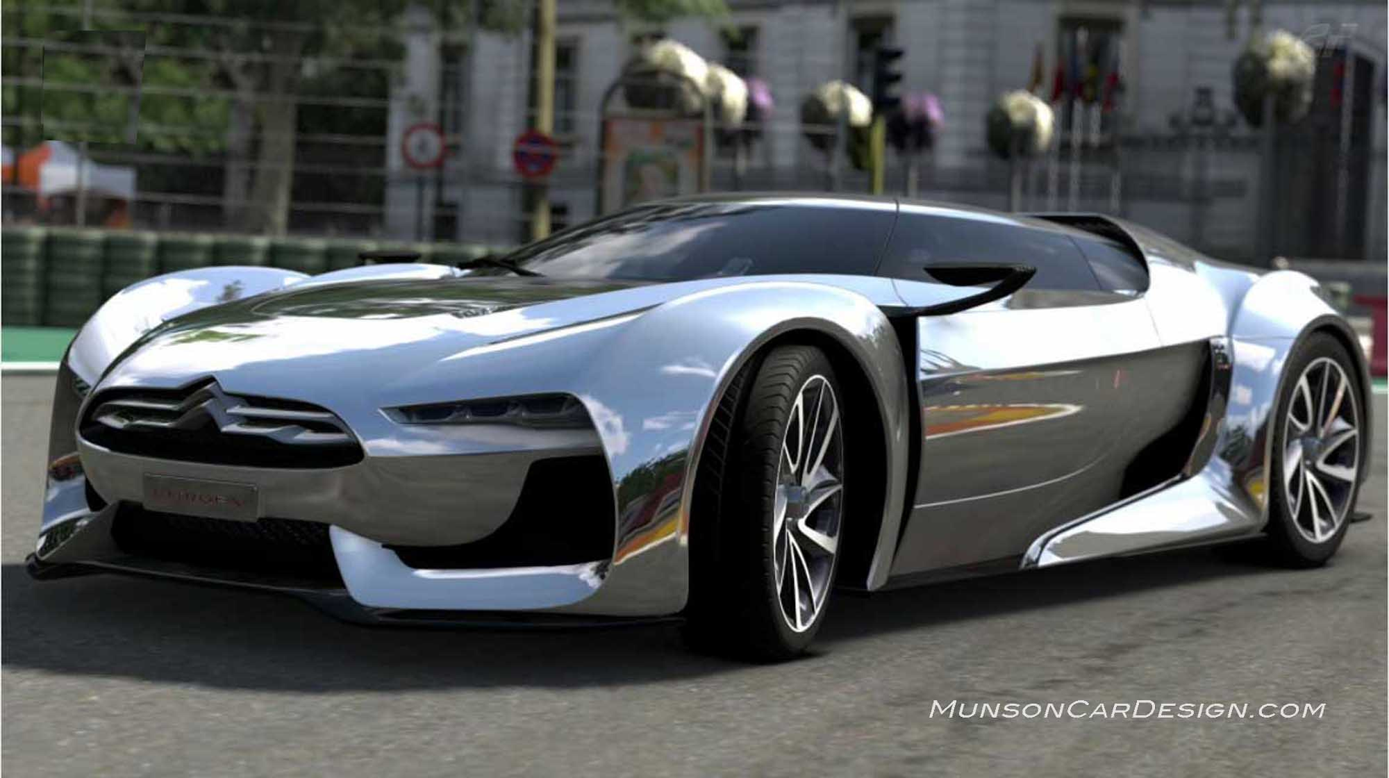
I decided to use a chrome car reference image in Vizcom to make the design more flamboyant. You have to be selective with your reference image to get the best results. The last image in this post worked well since it has high contrast and is very graphic.
I chose the Vizcom background in the featured image because it has a Syd Mead quality to it.
