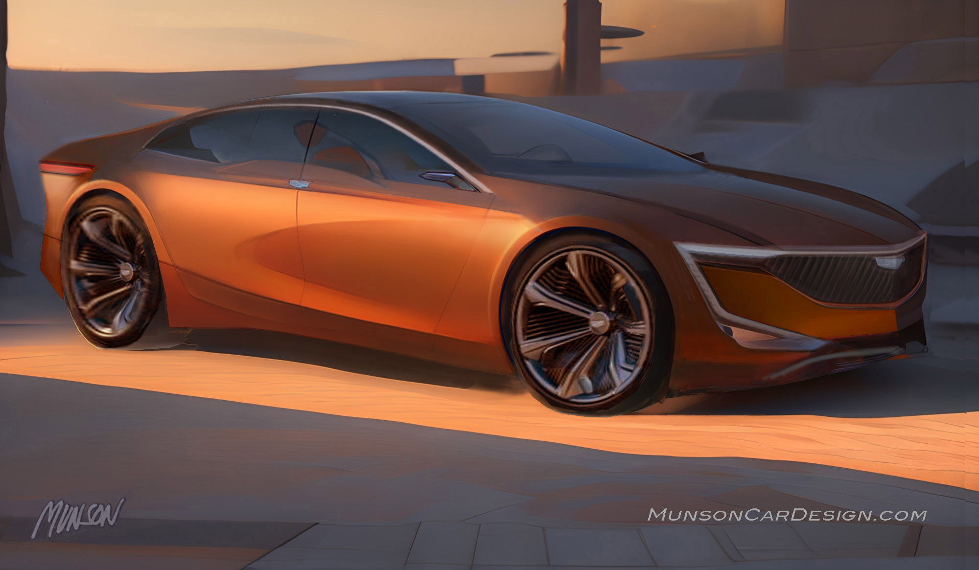
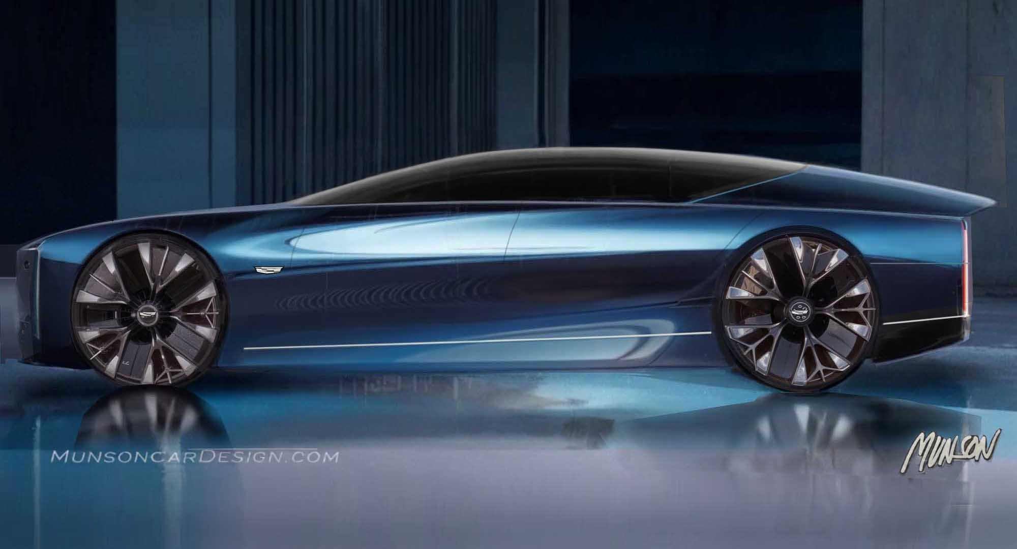
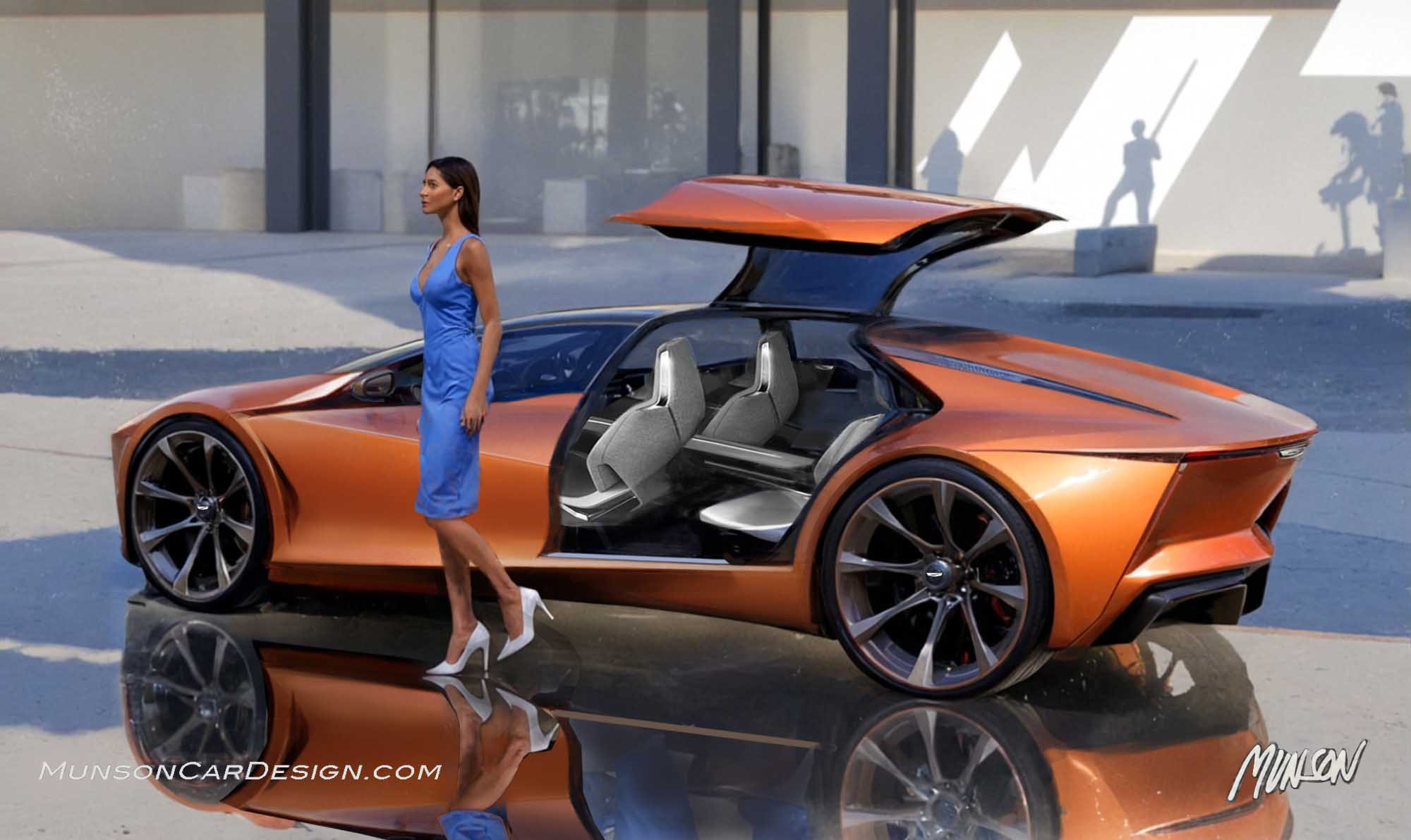
My goal with this design was to set a future vision for Cadillac design. My aim was to make Cadillac’s more beautiful and less angular. We often hear in design clinics that people want more ‘flowing lines’ in the styling of their cars.
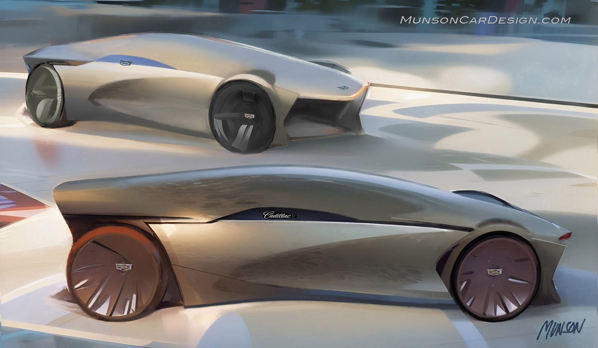
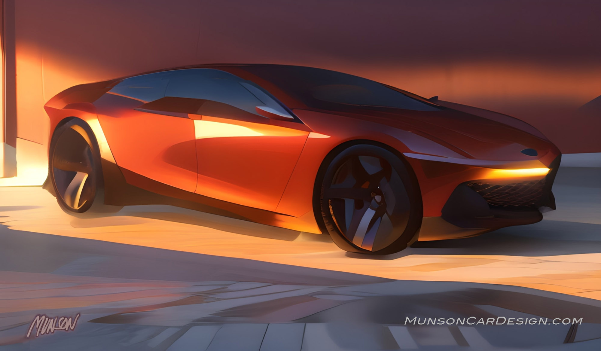
This was my attempt to introduce curvature to the surfaces and still make the design unmistakably a Cadillac. This proposal is an offshoot of the form study I did that resulted in the mid-engine Cadillac. I put a version of this front design on the Cadillac luxury sedan which is my third post.
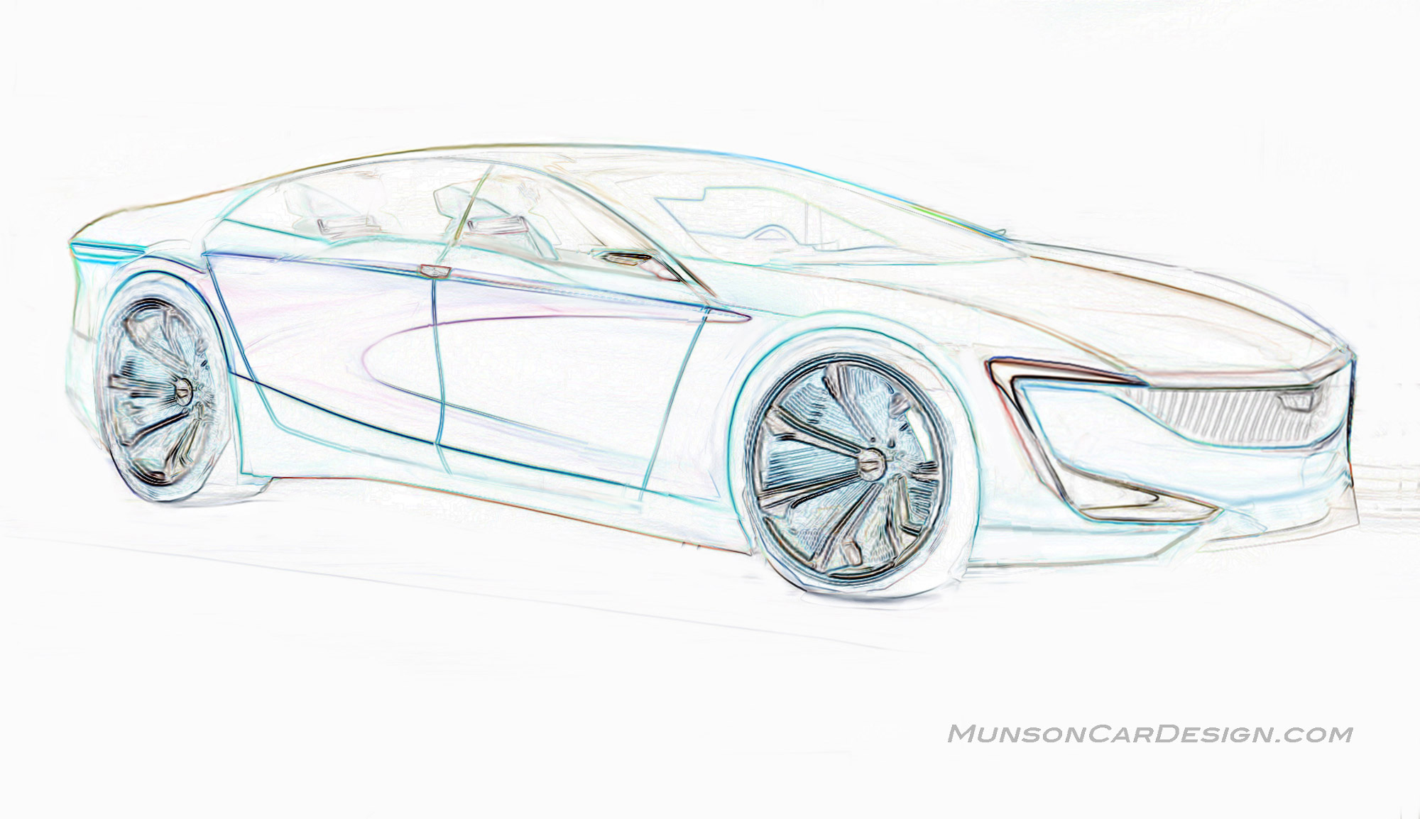
As you can see, some of the bodyside shapes from the form study in my second post found their way onto this concept car, not unlike a show car previewing future trends. The full width LED light signature gives this Cadillac a distinctive look. The beltline features a shield that displays the Cadillac crest. The low flowing silhouette of this concept is both elegant and modern.



2 Responses
Nice job!! Looks fantastic. A design direction Cadillac should take!
Looks great, Bob! You still “got it”!